Overcoming blankcanvasphobia
~ 16 January 2008 ~

I love rappelling. I don’t go that often, but when I do, I’m like a kid in a candy store — I can’t get enough.
Funny thing is, I’m scared to death of heights. Merely the thought of standing atop a cliff looking down makes my palms sweat. (And they already sweat profusely as it is.)
Staring at a blank canvas in Photoshop (or your preferred graphics program) feels the same way as standing at the edge of a cliff waiting to go over. You’re safely strapped in, but the idea of going from standing upright to lying on your back with feet planted on the side of a rock incline is terribly daunting. But once you’ve gone from vertical to horizontal, the rest is easy, and even thoroughly enjoyable.
With that in mind, following are a few pointers for getting over the design ledge, or as I phrase it for the sake of this article, overcoming “blankcanvasphobia.”
1. Familiarize yourself with how others have solved the same problem you’re solving. In his book How Designers Think, Bryan Lawson observes the following:
[D]esign is as much a matter of finding problems as it is solving them.
What you’re ultimately trying to accomplish when filling a canvas is the exercise of solving a problem. In my experience, rarely have I designed an interface for the likes of which someone else hadn’t already designed something similar. I find solace in scrutinizing how others have solved their design problems, and I also find it lends guidance for solving mine. Note that I’m not talking about finding influence among the litany of gallery sites on the web, but instead learning from the mistakes and successes of others.
2. Draw from previous work. In reality, if you’re at least a semi-experienced designer, you never actually begin with a totally “blank” canvas. You’ve stored plenty of style, typography, interaction, and other design elements not only in memory but in the archives of your portfolio work. Don’t hesitate to revisit elements that worked well in previous projects, as chances some of these same elements may work well in your new project.
3. Sketch it out. Fundamentally, a blank sketchbook page and a blank Photoshop canvas are equals: both are blank, and both can be intimidating. But in my mind, the difference between Photoshop and sketchbook is the difference between tool and creative space. When I’m in Photoshop, I feel obligated to act like a designer, as I’m surrounded by shapes, colors, guides, and so forth. In contrast, when I’m in a sketchbook, no tools are present, aside from the writing instrument in my hand. There’s less pressure to design, more room to be creative.
4. Begin with a grid. Part of the reason a blank canvas can be menacing is, well, because it’s blank — it’s empty, sans restrictions, no rules. One would think this freedom yields endless opportunities, but in my experience, it yields chaos more often than not. As ironic as it sounds, having a few rules in place can be incredibly liberating. Grids make beautiful design rules, as they force one to make conscious decisions about how the content should be honored long before worrying about the minutia of aesthetics, and they encourage creativity within given boundaries. For the record, I prefer a 960 px width grid for web work, but there are countless ways to utilize grids on the web. (Note that this recommendation somewhat contradicts the previous one about sketching. However, keep in mind this is not a sequential list, but instead a brief compilation of suggestions for getting over the edge.)
5. Begin in grayscale. I’ve done this several times lately, enough to validate the recommendation. Beginning a design monochromatically forces one to focus on three things: hierarchy, typography and the content these two design principles represent. I’m certainly not advocating color plays an insignificant design role, but that it is often supplementary rather than dictatorial. Pierre Bonnard, French painter in the early 20th century, describes it better than I:
Color does not add a pleasant quality to design, it reinforces it.
The easiest way to begin in grayscale is, not surprisingly, to set the image mode to grayscale (Image > Mode in Photoshop). From there, keep things low-fidelity, ignoring many of the design details you may add in later. Jason Santa Maria describes this approach in greater detail in his article, Grey Box Methodology.
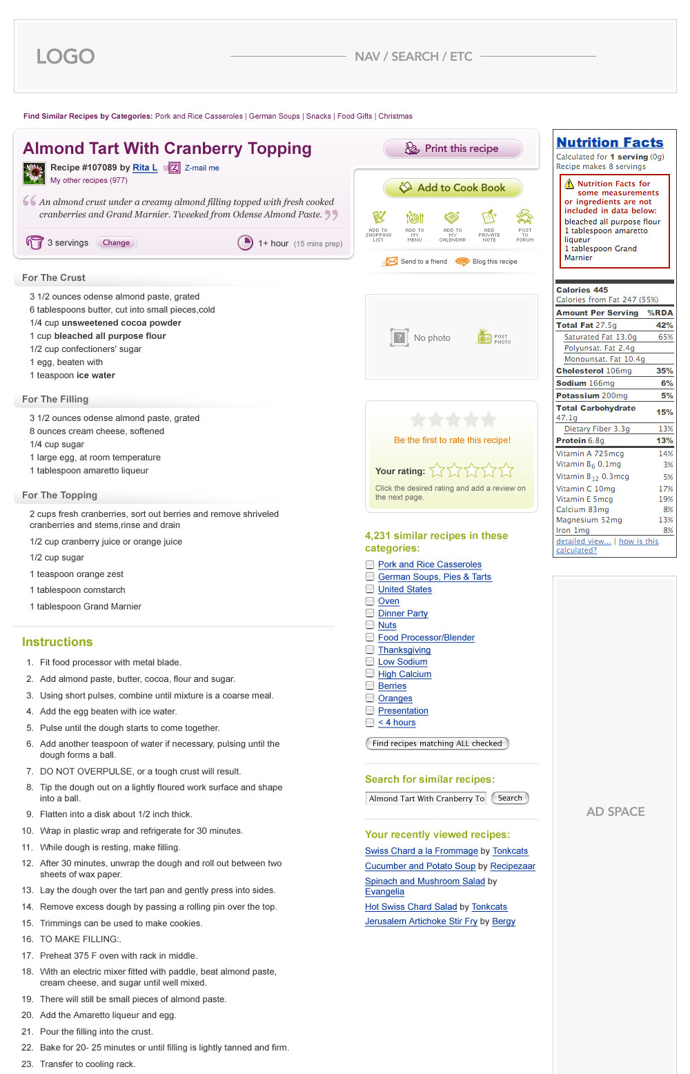
6. Start with the “core.” I’ve written before on designing the core actions of an interface first, as have 37signals. For example, note that this comp has no design in place for the masthead and some of the sidebar elements, as these are secondary to the “core” actions for the site (which, in this case, is the act of interacting with recipes).
7. If nothing sticks, come back later. I’ve also written before on the topic of unplugging one’s self when faced with creative block. This especially holds true when wrestling a blank canvas. Of course, some argue walking away is merely avoiding the issue, but I find it hard to force myself to design something if I’m not mentally prepared to do so.
Hope this advice helps as you go from the figurative design vertical to the horizontal.
30 Comments
Stock photography, type, and killer tees. Genuinely recommended by Authentic Boredom.
Nice article! :-)
Cameron, you’re a true genius. I always try to start designing buttons. May sound a bit weird, but they give you a great starting point for the rest of the design.
I’d even go so far as to say try ignoring imagery and focus on just the type and basic layout as well.
Yes, agreed. Knowing any photo I throw into a grayscale canvas will ultimately have to be replaced with an RGB one prevents me from spending too much time finessing imagery.
How huge my blankcanvasphobia is depends quite a lot on how much thinking, problem finding & solving, and scribbling of structure and contnet I’ve done before I even open Photoshop.
The more pre-PS thinking work I do, the more eager I am to start translating it into pixels. The less I do, the more, harder and taller are the walls I run full-tilt into while pixeling.
For me it’s a matter of seperating idea/content/structure questions from aesthetic questions as much as possible. Solve the former as much as you can and the latter will flow.
Great tips all, but I’d be careful that “starting with the core” doesn’t fragment what ought to be a holistic design. In the case of your recipe comp, inserting somewhat generic placeholders for ads or other secondary dynamic content makes sense, but I question your decision to omit something as important as the main navigation. It may not be the focus of the page, but, as an element that’s fundamental to getting around on the site, I think its relationship to the main content should be carefully considered.
Great post! I actually did a little presentation at RefreshMiami about interface design process that touched on overcoming the illusion of “creative freedom” :) I get over it by breaking the entire process down into small manageable chunks. Start from a list of what should be on the page and take little focussed steps although to a final look-and feel. Trying to tackle everything at once will leave you overwhelmed and subsequently paralyze you.
(Here’s the post if anyone is interested…slides are at the bottom)
http://tinyurl.com/2s6uls
Some great recommendations.
I had a professor say just this: There’s nothing scarier than a blank page. Just yesterday I caught myself with an open mouth starting at a blank canvas.*ugh* Thanks for the tips!
Great timing, as my students are about to design their first page! Thanks!
Blankcanvasphobia could also be equated to blankpagephobia if you have a writing project to complete (whether it be for the web or print) - the start is always the hardest, but once you’re into it, you’re away.
Great advice, Cameron. What I do at a start of a project, is to just pop in name of all the elements I will need, text only, and place them where my design-y sense tells me it fits.
Then I get some grayscale boxes fitted to the grid, fill them with some content and images. And that’s when the color and style gets into play.
Such a good article! The blank canvas is my most dreaded of web-design aspects. After a while, I always give up and go for the sketchbook.
I’m so glad to see your process laid out in such a way. I always approach a new project very analytically and methodically. I think using a grid and grayscale would definitely improve my process.
Wow. Nice post Cameron. Working on the new Jive Software site and my own as well and I literally have a very similar article ready to go for the new site.
Yours is of course much better written. Nice to have some validation though. :) Love the angle about rappelling. I’ve only been once and it was both terrifying and exhilarating. That first time over the edge. Wow. Talk about confronting your fears.
Nice article! :-)
Superb!!!
I design corporate interfaces and once I’ve open my photoshop canvas I then look for printed material (online) in the form of financial pdf reports. I find these contain great type, colors and stock images which you can grab inspiration from.
Great post!
Been practicing no 1,3,4, & 5 and thankfully they always work for me. In conjunction with no 3, I always bring a big Muji sketch pad anywhere I go. Despite the size, I find it quite handy especially when an idea sparks.
I recently discovered this handy (if not time-wasteful) little design stretching exercise on the QBN board. I call it Fantasy Album Art;
1. The first article title on the Wikipedia Random Articles page is the name of your band.
2. The last four words of the very last quotation on the Random Quotations page is the title of your album.
3. The third picture in Flickr’s Interesting Photos From The Last 7 Days will be your album cover.
4. Use your graphics program of choice to throw them together.
I find the restraints oddly liberating. You may think of this kind of exercise as procrastination, but there is the old story about two people who each have three hours to cut down a tree. The first person dives straight in and hacks away madly. The second person spends the first two hours sharpening his/her axe…
Great tips all, but I’d be careful that “starting with the core” doesn’t fragment what ought to be a holistic design. In the case of your recipe comp, inserting somewhat generic placeholders for ads or other secondary dynamic content makes sense, but I question your decision to omit something as important as the main navigation.
A good argument, Rob. The main navigation is often very important to the overall site and experience. Sometimes, however, it is not. In the case of this comp (which is now +2 years old), it was not — mostly nav for account login, search, community members, and so forth.
how designers think is a really great book :)
Cameron,
your rzcomp4a.jpg comp - did this site ever get developed? If yes, what’s its URL? Thanks!
Great piece Cameron. I’ve recently been playing around with grids and they’ve become an integral part of my process.
Do you find it restricting using a set width for a design or do you use 960px as starting point and extend if you need a little extra width?
nice article! very informative.
Cameron - I second everything you’re saying here. After several years of laying out sites, most of what you’ve described above has become my workflow. Good stuff.
Rappelling has nothing on this:
Sweetness!
I also think that a lot rests on the brief and info you have been given. So many times ive been asked to just “do something” and take it from there and its an impossible task. You end up stumbling on a design if anything. A good solid brief and some content is essential imo to creating something that works.
When I’m starting a new layout or design, I like to start with a wireframe. By defining rough areas where content will go, I can shuffle them around without concern about breaking some other piece of design and it makes it a lot more flexible. I like your grayscale idea, so I’m going to try that as the step after my wireframing and see how that works.
Verry cool post many thanks its usefull, i found you trough the podcast of boagworld!
Authentic Boredom is the platitudinous web home of Cameron Moll, designer, author, and speaker. More…

Full-time and freelance job opportunities. Post a job...
A selection of fine reading, available for a limited time only:
- Recent job listings, testimonials, and 100th Kiva loan
- The ISO50 Field Guide to Color Management
- Upgrading the hard drive and memory in a refurbished 13" MacBook Pro
- Inspiring type: Libro di M. Giovambattista Palatino
- Randomness, vol. IX
 CSS Mastery: Advanced Web Standard Solutions A solid round-up of indispensable CSS design techniques by Andy Budd, Simon Collison, and Cameron Moll.
 Mobile Web Design A guide to publishing web content beyond the desktop. Tips, methodology, and resources. Now available.
![]() Letterpress Posters The unassuming beauty of a freshly letterpressed print.
Letterpress Posters The unassuming beauty of a freshly letterpressed print.
![]() That Wicked Worn Look. Techniques for that worn, aged, distressed look.
That Wicked Worn Look. Techniques for that worn, aged, distressed look.
![]() Mister Retro Machine Wash Filters Turn the dial to “Instaworn” with these filters.
Mister Retro Machine Wash Filters Turn the dial to “Instaworn” with these filters.
![]() Blinksale Dive in and enjoy shamelessly easy invoicing from Firewheel Design.
Blinksale Dive in and enjoy shamelessly easy invoicing from Firewheel Design.
![]() Basecamp My preferred web app for internal and client project collaboration.
Basecamp My preferred web app for internal and client project collaboration.
![]() HOW Conference Austin, June 24–27. Pentagram, Adobe, P&G, et al.
HOW Conference Austin, June 24–27. Pentagram, Adobe, P&G, et al.
![]() Web Design World Seattle, July 20–22. Practical sessions on web design.
Web Design World Seattle, July 20–22. Practical sessions on web design.
![]() Stimulate Salt Lake City, September 2009. Entrepreneurship and design conference.
Stimulate Salt Lake City, September 2009. Entrepreneurship and design conference.
Linkage:
Follow me: ![]()
1 Dave S. ~ 16 January 2008
The greyscale tip is a good one — I’d even go so far as to say try ignoring imagery and focus on just the type and basic layout as well.
In putting together some printed material this month, there was a lingering question whether it would be printed in black or CMYK. So I originally designed it for black, figuring I could come back later and add color later. That allowed me to really polish the basics, and I think I got a better end product as a result.