Gridding the 960
~ 14 December 2006 ~
You might recall a certain dialogue on this site about optimal layout width for 1024px. And perhaps your astuteness leads you to recollect the ensuing dialogue about fluid vs. fixed width.
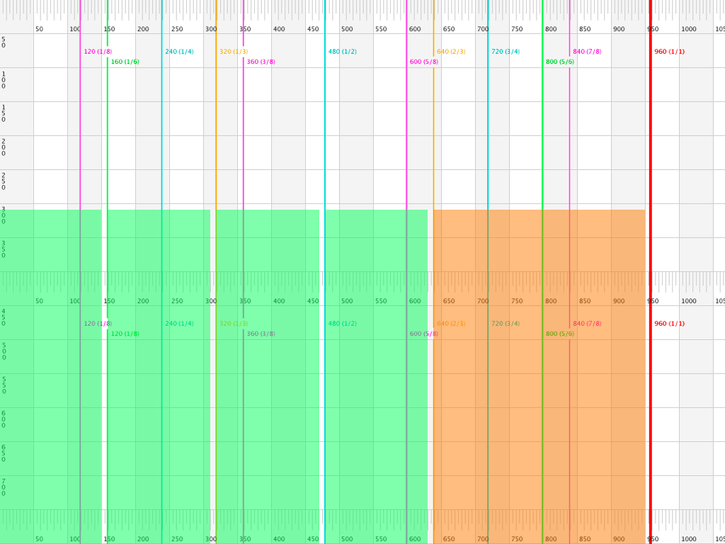
Shift gears for a moment and see if you recall Khoi Vinh’s discourse regarding the use of a background image grid for Subtraction.com (or for TheOnion.com redesign). Cross that with Greg Storey’s px ruler background image and Christian Watson’s similar image, and the culmination of these recollections might be the following:

Background image grid + pixel ruler + column divisions for 960px-width layout, all in one mean little package. Consider the possibilities:


…and so on.
Not keen about constructing your own grid? Try skipping the background image thing altogether and employ Dav Glass’ YUI Grid Builder.
In related news, this was one of the items covered in yesterday’s Web Design World workshop, which appears to have gone over well based on audience feedback. My first time in Boston too, and what a gorgeous city! I’m counting the days before returning in March. Cheers, Boston.
29 Comments
 Veer: Visual Elements for Creatives.
Stock photography, type, and killer tees. Genuinely recommended by Authentic Boredom.
FYI, the first grid (3 column) image links to a small image while the others link to a full-size.
This is the closest I’ve gotten to construction my own grid on a site: dfckr grid. I used that in conjunction with Andy Budd’s Layout Grid Bookmarlet, which works wonders.
Very nice little trick.
Awesome post! I really learned a lot by looking at the images you made and exploring some of the sites you linked to.
I did find a small mistake, you might want to fix in your 960grid.png image. On the 160 (1/6) line you have it listed as 120 (1/8) on the bottom.
Great!
Very useful!
YOU SO ROCK!
Thanks for the grid :)
Thanks Cameron,
This is Awesome.
FYI, the first grid (3 column) image links to a small image while the others link to a full-size.
Good catch, Josh. Fixed.
On the 160 (1/6) line you have it listed as 120 (1/8) on the bottom.
Also a good catch, Brent. I’ll have to take care of that one later (still at airport).
Thanks Cameron, that’s going to come in real handy!
That YUI Grid Builder is amazing!
Though I’m having problems in downloading the CSS that it produces.
I’ve created a layout I’ve always wanted but never could seem to figure out how to code. When I click “show code” in YUI Grid Builder, it links to stylesheet’s that I can’t seem to find where to download. :(
Is anyone else having similar problems with YUI Grid Builder, or know what I’m doing wrong.
Thanks
Jake
That was great, i was in the Boston event and you did a very well and informative presentation.
Not to throw cold water on a very helpful little article, but I have started to notice something about this whole grid thing that concerns me. I’m all for grids, obviously, but it seems like it’s becoming so standardized that it risks missing the point of using them in the first place (I’m not saying Cameron misses the point, just that something is more generally missing from the dialogue).
What so many “nouveau grid” systems seem to have in common these days is a rigid adherence to evenly-sized columns and page symmetry, as is common with traditional newspaper design. On the web, there is the possible exception of an uneven left or right column to support ads or a navigation, but otherwise the columns tend to be pretty evenly spaced. That is, web sites might have a A-B-B-B-B layout or a A-A-A-A-B layout, where A is one width and B is another.
But this doesn’t have to be the case. There’s no reason why your grid can’t have an A-B-C-D-E structure with many different column sizes. Or a structure where there is one grid at the top of the page and another at the bottom. Looking at the history of grid systems, non-regular grids aren’t unheard of and can be very exciting and dynamic in their implementation.
The point of a grid is not primarily to ensure that all of the items on a single page are evenly sized and evenly spaced, or to achieve columnar regularity across a page’s elements. There’s nothing wrong with using a regular simple grid as a core design strategy (in fact most designers would probably benefit from that approach to help guide them away from completely haphazard structures), but it’s not the best reason to use a grid for your design. Rather, it is intended to ensure graphic consistency across many pages, to establish a stronger brand identity and page readability across a wide variety of page layouts and content types. This can be accomplished with many types of grids.
Think i’ll use this. Thanks
Nice article @ 24 Ways
Fabulous feedback, Christopher. A point made well.
I just wanted to say, that if you are reading this, then you’ll be designing with the big boys in no time…
I’m going to place the grid pic in a PSD called gridStarter ;)
Grids are useful and needed stuff but somehow I don’t like locking stuff in them. In a creativity test I took a few months ago, people who drew out of the box got higher points and I think the same applies to web design. Sometimes, getting out of the grid will boost your creative engine whilst keeping in grid is sane for projects that demand it.
Don’t find this as a disregard (this grid was already subject to one of my pieces ^_^) but I belive that fixing stuff in a grid isn’t always the way to go.
Christopher mentioned about grids being used in print design and maybe this post could be used as an intro to an article about print design?
Anyways, beautifull work, like the grid image very much :)
Excellent! I literally just opened Photoshop to start a new design for a client. What timing!
Cameron:
Very handy grid!
I can definitely say I enjoyed your talks at Web Design World in Boston.
Hope you are able to consider the opp. to be a part of our advisory board back in Full Sail at some point in the future.
All of this and that about formating. When the client just wants t done and done pretty. And with flash and style and they still really dont care about getting on pdas
Weird eh
You know, I actually ended up at 932px for my site’s new design. The two factors that led to that width was that I position my Dock on the right of the screen, and that I also left a little room for the scroll bar.
Still, though, it looks like a handy resource! I’ll have to give it a whirl on my next project. :)
Great post — I really appreciate what you do for the design community.
I don’t know what caused it, but if you view the image in Safari and then right click to save the image, the measurements won’t line up. If you just right click the link and save the image directly everything should look good when you open it up in PS.
Hopefully that saves someone a bit of trouble :)
In addition to Mr. Fahey’s comments, one should also remember that many grid systems used in print are based on the geometry of the “golden rectangle” and the ISO paper system. They aim to utilize the inherent relationships found between objects arranged on a page as they relate to one another and the golden rectangle itself.
Great post and thank you for the image. This is a great help!
I am thinking about the ruler though. It is based on a “normal” ruler a 10px grid with 10 subdivisions.
My designs are usually based on a 16px grid with 4 subdivisions. So for me i would be much easier to have a ruler based on 16px. So i took your image and changed the ruler to a 16px-based ruler.
If anybody is interested you will find it @ http://www.the-lighthouse-keepers-cat.com/wp_en-EN/2007/04/10/84/
thanks for grid ;)
Thank you for the excellent work.
What resolution did you use when you made that image? Not only does it appear to be a little blurry, but the lines in the image do not line up with the pixel ruler in Photoshop. Just curious.
Do these spammers understand what rel=”nofollow” means or even does? This is to all spammers, everywhere: STOP. WE DON’T CARE ABOUT YOUR LAME PRODUCTS. YOU SUCK AT LIFE. DEAL WITH IT.
Authentic Boredom is the platitudinous web home of Cameron Moll, designer, author, and speaker. More…

Full-time and freelance job opportunities. Post a job...
A selection of fine reading, available for a limited time only:
- Recent job listings, testimonials, and 100th Kiva loan
- The ISO50 Field Guide to Color Management
- Upgrading the hard drive and memory in a refurbished 13" MacBook Pro
- Inspiring type: Libro di M. Giovambattista Palatino
- Randomness, vol. IX
 CSS Mastery: Advanced Web Standard Solutions A solid round-up of indispensable CSS design techniques by Andy Budd, Simon Collison, and Cameron Moll.
 Mobile Web Design A guide to publishing web content beyond the desktop. Tips, methodology, and resources. Now available.
 Letterpress Posters The unassuming beauty of a freshly letterpressed print.
 That Wicked Worn Look. Techniques for that worn, aged, distressed look.
 Mister Retro Machine Wash Filters Turn the dial to “Instaworn” with these filters.
 Blinksale Dive in and enjoy shamelessly easy invoicing from Firewheel Design.
 Basecamp My preferred web app for internal and client project collaboration.
 HOW Conference Austin, June 24–27. Pentagram, Adobe, P&G, et al.
 Web Design World Seattle, July 20–22. Practical sessions on web design.
 Stimulate Salt Lake City, September 2009. Entrepreneurship and design conference.
Linkage:
Follow me: 
1 Blair ~ 14 December 2006
Just wanted to say thanks for the background grid. I appreciate it.