Aaron Cannon’s Web Accessibility Checklist
~ 09 June 2008 ~
I have the privilege of having several capable individuals on my team, one of which is Aaron Cannon, blind web developer and accessibility consultant. In his recent article, “The Accessibility Checklist I Vowed I’d Never Write”, Aaron explains the problems with a “simple checklist that, when followed, will give you an accessible site without fail.” No such checklist exists or likely ever will.
However, as Aaron, myself, and others have been wrestling with establishing in-house training material, we’ve found a one-page checklist to be a necessary supplement to our approach, in addition to workshops, design reviews, and so forth:
When I wrote the below checklist, I attempted to answer the question, ‘What concise pieces of advice can I give to designers that will have the greatest impact on accessibility in the majority of cases?’ Again, this list is not the perfect solution, nor is it the only solution, but I believe it is a good first step, and it gives our developers and designers a place to start from.
Available for download is Aaron’s checklist (PDF):
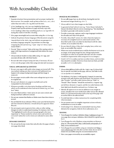
You can also find these guidelines in text format in Aaron’s article.
We’re posting this publicly with the hope that 1) it’ll be of benefit to the community and 2) you offer your critique and feedback. Please consume, print, and critique it.
Update: Video showing how Aaron Cannon uses the web.
32 Comments
Stock photography, type, and killer tees. Genuinely recommended by Authentic Boredom.
Thanks for the checklist- it’s definitely more “user-” than “regulation-” focussed, which is great to see. I particularly liked the testing tips. Thanks for this!
Thanks for sharing Cameron. I just barely read this on North Temple this morning. Definitely something we as designers and developers can work harder at. Well done Aaron!
I find it ironic, that the checklist is provided as a PDF file.
…and as text (in Aaron’s article). We debated but in the end felt having a printable version as well would be handy, given a) we’re already handing it out internally and b) those who will need to refer to this list most will be sighted individuals.
All things considered, the PDF still reads fairly well with a screen reader.
I think you should add:
- Use CSS text-transform to style items in upper case. This aids screen readers in which there is a difference between DANIEL and Daniel.
-Make proper use of the scope properties of table elements.
@Rick Curran: James Edwards has written on AJAX and accessibility.
Very great post! Thank you for sharing this with us. Though there is plenty of material throughout international or national laws/guides, it’s always good to have it underlined by a handicapped internet user.
@John Faulds: Thanks for that link, interesting tests.
I wonder though if there have been any improvements in Javascript / AJAX support with screen readers in the last couple of years? (that article was written in May 2006)
Cameron, can Aaron give any feedback on his experience of Javscript / Ajax support in screen readers?
Great checklist, one of the best I’ve seen (and I’ve seen a lot in my time).
Just a couple of things I’d add.
- Place unique content first when providing meaningful and accurate content in the element. This helps screen reader users specifically because they don’t have to listen to the same thing over and over to get to the unique content and helps everyone generally by making multi window/tab browsing more usable.
- Limit the number of skip links provided to a maximum of 3, and make them visible, or appear on focus. This helps keyboard only users who don’t have access to the tools that screen reader users have.
- Using lists for navigation allows screen reader users to “scan” a page quickly and build a mental model of the size of the site/navigation without having to listen to and count each element.
- Be sure that pages remain usable when users reduce text size by two steps. This helps users with tunnel vision who may reduce the text size in order to reduce eye strain when reading on screen.
- Ensure that any changes which occur on hover also occur on focus, to aid keyboard only users.
- Don’t autoplay multimedia content - this can be confusing for screen reader users (if/when sound starts up when they’re reading something else) and those with intellectual disabilities such as those with dyslexia, who may find it difficult to read other content because they are distracted by it.
- If using images of text, ensure that the text size is reasonably large and provides good contrast to help users using screen magnification, as small images of text will pixelate when magnified and may become impossible to read.
- Limit the use of images of text (or image replacement) to only the main heading of a page to avoid users who require specific colour schemes from having to disable images in addition to changing their colour scheme in order to be able to read the content of the page.
- Be aware when writing legend text that it will be read out by screen readers in addition with label text, and try to ensure that each item makes sense when combined as well as on its own.
- Ensure that any help or required field indicators are provided within the label of each form element, not after the form element, as otherwise screen readers may miss this information while moving through the form in forms mode, and screen magnification users may never see them as they’re unlikely to scroll past the end of the form.
- The Paciello Group Colour Contrast Analyser is your friend.
Cameron, can Aaron give any feedback on his experience of Javscript / Ajax support in screen readers?
I anticipate Aaron will chime in very soon, but he’s been dealing with the really bad weather hitting the midwest and hasn’t been online a whole lot the last 24 hours.
@Rick Curran:
I wonder though if there have been any improvements in Javascript / AJAX support with screen readers in the last couple of years?
Be sure to take a look at WAI-ARIA (Web Accessibility Initiative - Accessible Rich Internet Applications); here is a link to the WAI-ARIA Overview.
Great additional tips pixeldiva; I was going to mention that auto playing multimedia content is not a good user experience, but you went way above and beyond - way to go!
huh, I sure did learn a lot from Aaron’s and pixeldiva’s accessibility checklists. Thanks a lot. Look forward to reading Aaron’s response on JS/AJAX questions.
I always an appreciate receiving feedback from those who are pained the most; thank you, Aaron.
Just an item of note. The first item under Markup is “Separate structure from presentation” so this statement should not be an issue/practiced: “leave the text for decorative images blank (e.g. alt=”“).”
List looks pretty good except I also have a major issue with the JavaScript blurb. In my experience, this is THE largest challenge in developing for web accessibility, especially now with Ajax being so popular. Last I checked, WCAG and all other accessibility guidelines require that content and functionality should not require JavaScript.
Great list and additions from pixeldiva.
I have a few other suggestions that I use when building my FORMs.
- Place your INPUT elements in either an “OL” or an “UL”, this will give individuals using a screen reader an idea of how many items they have to fill in FIELDSET or part of the FORM. You can use CSS to hide the bullets.
- Do not use “Display: None;” in your CSS use absolute positioning to have the item displayed off screen visually.
- Place the word “Required” inside the LABEL surrounded by <em></em>, so the word is emphasized and can be hidden using CSS. Plus you can do this with any other verbiage that is helpful to the filling out of the form.
- Any ERROR messages can be part of the label and surrounded by <STRONG></STRONG>, so they be emphasized too.
- Do not use on “FOCUS onLoad” so cursor goes to the first INPUT field, because the person using the screen reader will be forced to skip over any directions about the forms.
- For FORMs write clear and simple directions of what should be done and what information you are looking for.
- Send SEARCH results to the same “Main Content” anchor you set up for your “SKIP Navigation” so individuals are not sent the top of the page and hear the SEARCH box again and think they have not done the SEARCH.
Example code -
<form name=”Skills_Search” action=”searchResults.asp#MAINCONTENT”>
Hope these suggestions are helpful.
Hi all. Thanks for the feedback.
Rick:
Dynamic HTML can definitely be a problem for screenreaders because they often don’t realize that the page has updated, and when they do, they don’t always notify the user of such changes.
As I understand it, when a page finishes loading in the browser, the screen reader loads the page from the DOM into what Jaws for Windows (a popular screenreader) calls a virtual buffer, and then the page is read from that buffer. Up until recently, screenreaders didn’t always update the virtual buffer when the page changed. As a result, the user might read an out of date copy of the page, and never realize it. Fortunately, this seems to be much less of a problem in more recent versions of screenreaders. However, the problem of how to notify the user not only that the page has changed, but also how to direct the users attention to the updated content remains an issue.
In addition, we have found that if you make content clickable through JavaScript by simply adding an event listener, rather than by associating an onclick event with that element, that Jaws does not recognize that that portion of content is actionable, hence the user is left unaware that she can click on it. (Please forgive if this is not clear; JavaScript is not my area of expertise.)
Hopefully ARIA will solve many of these issues, but that’s still a few months off, at least.
With the above limitations in mind, Aaron Barker (a co-worker) and I have been working on some reusable dynamic patterns. These patterns include things like Autocomplete, input hint, datepicker, ETC. They’re not perfect, but there much more accessible than most others I’ve seen. However, it hasn’t been easy, and we’ve really had to just do a lot of experimentation to find out what works. I don’t think we’re at the point of being able to write guidelines yet.
Daniel:
I like the suggestion of including the scope attribute. As for using text-transform, I don’t think its a big enough issue to worry about much. My screen reader rarely spells things out, unless they are unpronounceable (I.E. they contain no vowels). Anyway, we screenreader users get accustomed to the accents and mispronunciations of our speech synthesizer’s to the point that we don’t even notice. I used to on occasion accidentally refer to ICQ as “ick,” as that’s what I was hearing all the time.
I’ve seen too many lengthy discussions on getting screenreaders to pronounce things properly, and as a screenreader user my self, I have to say that that issue is probably either at, or very near the bottom of my list of obstacles to accessing web pages. Just my $0.02.
pixeldiva:
Good list. though the autoplay issue is interesting. ON the one hand, if I got to a page, like a video page on Youtube, I almost certainly went there for the purpose of watching a video, and so I shouldn’t have to look for a play button. If, however, the video is just one of many pieces of content on the page, then you definitely have a point.
Dennis:
I agree that it is a big problem at the moment. I truly hope that ARIA turns out to be all we hope it is, as I think that the demand that sites not require JavaScript is totally unrealistic in many instances.
Perhaps I will give some thought on what I might be able to write up to help mitigate the current lack of information in this area.
Thanks again and please let me know if any of the above is not clear or if I missed any questions.
Aaron Cannon
A truly splendid list, i find it well assembled into one page including most of the essential points. As I possibly couldn’t put it better myself I ask of permission to translate the list into finnish and further share it with proper source credits given to you and Aaron.
Hi, and first of all: thanks! Very compact, very helpful. Will definitely use this. I would like to add one point to the list about markup: use compact, meaningful names: describe function rather than style. Use ‘sidebar’, rather than ‘column-right’; ‘level3’ rather than ‘subsubsublevel’; avoid names like ‘h4.subheader_blue’.
This checklist will help me to improve my personal quality for websites.
But, why should i use a offline-checklist if there are many online-validations?
Ralph
Ralph, an accessibility validator will tell you very little about what you did and didn’t do well because much of this list is subjective and difficult to test with an automated system. In fact, many, if not most, of these guidelines require good human judgement to be done (and tested) properly.
Hi Aaron and Cameron,
First off, thank you very much for posting this online! I think it provides a great overview of the subject.
My question for Aaron has to do with access keys. I didn’t see anything in the checklist regarding access keys. And I was wondering in your experience, if you’ve found them helpful for navigating websites and believe their important to implement?
Any information on how you believe they should be implemented, or things that have annoyed you about their use around the web in the past, would be great to hear!
Thank you.
This list is very helpful. After watching the video I think web developers (myself included) should be required to navigate their website at some point with a screen reader and the monitor turned off.
This checklist will help us to improve GUI design quality. Are you aware about any online accessibility testing tool like W3C XHTML
This list will be very useful to have around when I need something to quickly run through before launching. With all the little nuances you sometimes forget all the details, though admittedly, most of these I do everyday.
Thanks for sharing with the class Cameron.
Thomas:
Feel free to translate, including a link to this blog post or the original article, or both, as you mentioned. Thanks also for your interest.
Daniel:
There is only one site that I use access keys on, and that is a forum that I use every day. What’s more, I only use one, and that is the key to go to messages that are unread.
If It’s not a site I use nearly every day, and one with a complex enough layout that jumping around is difficult, then access keys do nothing for me. However, they do, at least in theory, help sighted persons who navigate the web with the keyboard. Unfortunately, in practice, this doesn’t usually work out because there doesn’t seem to be a good way to communicate the list of available access keys to the user.
Finally, for those who asked about automated testing for accessibility, tools for testing accessibility are about as common as tools for testing for good design. The best tools are only good for checking if you forgot something simple like an alt attribute, a heading, or something similar. No application that I am aware of can tell you if you used link text that can be understood out of context, required the perception of color, ETC.
Thanks.
Aaron
really intresting.
Yikes. Tiny fonts. Gray fonts. Could you possibly make this page harder for me to read as an aging human? I’m viewing this in Firefox 3 on Kubuntu Linux, FWIW. This page looks like it’s dominated by printing industry influenced design. Could I introduce you to the Internet, some day. And, I’m guessing you’re a Mac user who rarely checks how things look on non-Macs. Just guessing, but that’s usually the source of tiny-font problems. Wow.
Aaron, thanks for your work on this issue (and thanks, Cameron, for publicizing the checklist).
Daniel, I’ve used some automated tools to do baseline accessibility assessments, but it’s pretty easy to game the system. A commuter rail service near me has a site that passes, and they claim compliance with Section 508. But even a cursory glance at the site says otherwise. They use pre elements for their time schedules. Good luck figuring out which train to take!
Another nugget to add would be that when you have an image with textual content and the text isn’t really big and clear - whether you’re using an <img> element or an image replacement technique - put a title=”…” attribute on the element replicating the content of the text. This means that if your image is a bit fuzzy or the font is very fancy, a sighted user can hover over it and get the text in a crisp, clear tooltip.
I love this checklist. It’s a very good summary. I’ve translated it into German. I’ve also added some links (most of them in German).
Authentic Boredom is the platitudinous web home of Cameron Moll, designer, author, and speaker. More…

Full-time and freelance job opportunities. Post a job...
A selection of fine reading, available for a limited time only:
- Recent job listings, testimonials, and 100th Kiva loan
- The ISO50 Field Guide to Color Management
- Upgrading the hard drive and memory in a refurbished 13" MacBook Pro
- Inspiring type: Libro di M. Giovambattista Palatino
- Randomness, vol. IX
 CSS Mastery: Advanced Web Standard Solutions A solid round-up of indispensable CSS design techniques by Andy Budd, Simon Collison, and Cameron Moll.
 Mobile Web Design A guide to publishing web content beyond the desktop. Tips, methodology, and resources. Now available.
![]() Letterpress Posters The unassuming beauty of a freshly letterpressed print.
Letterpress Posters The unassuming beauty of a freshly letterpressed print.
![]() That Wicked Worn Look. Techniques for that worn, aged, distressed look.
That Wicked Worn Look. Techniques for that worn, aged, distressed look.
![]() Mister Retro Machine Wash Filters Turn the dial to “Instaworn” with these filters.
Mister Retro Machine Wash Filters Turn the dial to “Instaworn” with these filters.
![]() Blinksale Dive in and enjoy shamelessly easy invoicing from Firewheel Design.
Blinksale Dive in and enjoy shamelessly easy invoicing from Firewheel Design.
![]() Basecamp My preferred web app for internal and client project collaboration.
Basecamp My preferred web app for internal and client project collaboration.
![]() HOW Conference Austin, June 24–27. Pentagram, Adobe, P&G, et al.
HOW Conference Austin, June 24–27. Pentagram, Adobe, P&G, et al.
![]() Web Design World Seattle, July 20–22. Practical sessions on web design.
Web Design World Seattle, July 20–22. Practical sessions on web design.
![]() Stimulate Salt Lake City, September 2009. Entrepreneurship and design conference.
Stimulate Salt Lake City, September 2009. Entrepreneurship and design conference.
Linkage:
Follow me: ![]()
1 Rick Curran ~ 09 June 2008
That’s a handy little list!
I’m curious:
This indicates that AJAX can be a hindrance to accessibility, I’m curious to know Aaron’s / your opinion of AJAX-ified sites and accessibility? Some more guidelines specifically relating to AJAX would be useful, again I’m sure a list isn’t the perfect answer but it would still be useful!