Extensible CSS Interface IV: Testing for Extensibility
~ 01 April 2008 ~
This is the fourth and final article in the four-part series, “The Highly Extensible CSS Interface”. Markup and images for this article:

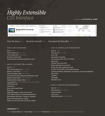
Finally, we’ve arrived. This concluding article provides the full demo, as well as a bookmarkable site that gives you quick access to all resources mentioned throughout the series.
Additionally, what follows below are 8 benchmarks to measure the extensibility of your site or app. I certainly don’t advocate that every site or app must comply with all of these benchmarks, but I do recommend trying to comply as best as possible with each of these when applicable to your project.
1. Translation
When I sat down to author this article, translation of all things was the first to come to mind. I suppose that’s because it’s been on my mind not only at work but increasingly as I realize just how global our economy is becoming.
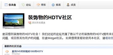
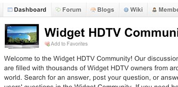
Perhaps the easiest way to test for translation is to send your prototype through Google Translate. Here’s what the demo looks like translated to Chinese (Simplified). Fortunately, a fringe benefit of bulletproofing is that elements containing text are inherently capable of accommodating changes to the length of the text that occur as a result of translation.
However, bulletproofing alone isn’t always enough, as we must make smart choices about what will be image text and will not be as we design the layout. In the demo, only one phrase in the entire interface is image text — the logo. The rest is HTML text. This was done specifically to make translation as easy possible, sparing ourselves from having to create a set of graphics with translated image text for every language our fictitious app may be translated into.
In the end, you’ll have to decide on image text vs. HTML text based on the translation needs of your site or app, on how much typographic control needs to be retained through imagery and how much can be relegated to browser rendering, and so forth.
2. Text Resizing
This benchmark is fairly straightforward: Make it work for low-vision users, whose default text size may be different than yours. A general recommendation is to accommodate up to two sizes larger. You can also accommodate text sizes smaller than the default, but my opinion is that if a user chooses to go smaller than default, he or she accepts that things may not be legible anyway.
Testing for text resizing is pretty easy: Command/Ctrl + (in most browsers), and then analyze how elements containing text accommodate changes in text size. And if you’d like to explore an interesting technique for having the entire interface resize (not just text elements), check out Jon Tan’s Em & Elastic Layouts with CSS.
3. Resolution Dependence
I’ve talked about resolution dependence extensively throughout the series, so I won’t elaborate further other than to suggest you check out Richard Rutter’s list of resolution dependence techniques, which he refers to as variable fixed width layout.
4. Images Disabled
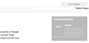
This one’s an easy step to overlook. Be sure to test how your layout renders in the absence of images, not only for reasons of accessibility but also to be sure background images have a supporting background color. In the example above, the Featured Member section is created with dark background images and white text. If I’d forgotten to add a dark background color, even though it’s not visible when background images are present, I’d leave users with white text on white background when images are disabled.
5. Styling & Scripts Disabled
Disabling styling and scripts tells us if we’ve separated presentation and structure properly, which yields a variety of benefits, not the least of which are accessibility and alternate device rendering (e.g. mobile).
As Dan Mall pointed out in Part II, the goal as it pertains to scripting is unobtrusive JavaScript, or the separation of JavaScript from the markup and CSS layers.
Two Firefox plugins for not only easily disabling images, styles, and scripts but also for inspecting and manipulating markup on the fly are the Web Developer Toolbar and Firebug. I recommend you install both. Additionally, there’s the IE Developer Toolbar (IE 6 and 7) and Safari Web Inspector.
6. Color Contrast

When you consider roughly 8% of the male population is color blind, you quickly realize a significant chunk of your user audience may have difficulty using your site if color contrast isn’t properly tested. (As an interesting aside, I’ve had at least one color-blind designer on my team for nearly the entire length of my career.)
The utility I prefer to use for quickly assessing how color-blind users will see my interface is Color Oracle. It’s free, very lightweight, and allows you to test color blindness in any software or window on your machine. Also give Pabini Gabriel-Petit’s thorough article a read: Ensuring Accessibility for People With Color-Deficient Vision.
7. Rebranding
Those of you who develop software that is licensed to other companies who in turn rebrand your software as their own will know what I’m talking about here. Inherent in the practice of web standards — and the practice of extensibility — is the ability to “reskin” an interface fairly easily.
To see what I mean, uncomment the following line of code in the demo to see a simple rebranding of the interface:
<link rel="stylesheet" href="css/branding.css" type="text/css" />Again, this rebranding is rather minimal, but the point here is that by properly separating structure and presentation, changing the skin of an interface is relatively easy. Of course, you can really reskin the same markup by changing the CSS rather wildly, as demonstrated by the css Zen Garden project. My example pales in comparison, but hopefully you get the point.
8. Mobile
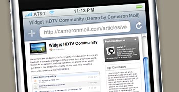
Lastly, I’d be remiss to skip mobile when speaking of extensibility. Regrettably, this demo is not a stellar example of mobile extensibility, as I’ve not had time to create a mobile-friendly version of the interface. I got lucky with iPhone (picture above) only because of the resolution dependence built into the interface, which works surprisingly well on iPhone. But if I had the time, I’d explore options for mobile adaptation, context, and all the other stuff you can read about in my book.
Signing Off
And so the series comes to a close. Before leaving, it’s worth stating these benchmarks are not all-inclusive. There exist other benchmarks that may be considered, but the ones I’ve presented here I feel summarize extensibility fairly well.
Thanks for participating in the series, either as innocent bystander or active participant. This is your last chance to call me out on anything that’s wonky or misleading, so please do so. Otherwise, happy extensibilitying.
29 Comments
 Veer: Visual Elements for Creatives.
Stock photography, type, and killer tees. Genuinely recommended by Authentic Boredom.
Great series Cameron. Thanks for putting this together. I am continually learning from you.
Great series. Thanks for sharing this.
Cameron, I’m seeing the ‘Popular topics’ panel in your demo site indented about 50 pixels or so using Safari 3.1 on Leopard.
Thanks for the series, very interesting to read :)
~Rick
I notice the lower table underneath the “Popular Topics” tab appears to be a little wonky in Safari 3.0.4 on a Mac. It appears to have an excessive left margin. Just thought I would let you know.
I have really enjoyed this series! Thanks!
Rick, Derek, that’s one of the “bugs” I mentioned in Parts II and III (also documented as a comment in the final markup). I debugged this for a couple hours a while ago and couldn’t for the life of me find what was causing it. I welcome any suggestions from crowd.
Cameron, the offset in Safari has something to do with the element:
Popular Topics
I see the CSS for it is:
.tabberlive .tabbertab h3 {
float: left;
text-indent: -9999px;
}
I haven’t dissected the code yet but if the intent is to have it off-screen while styles are on wouldn’t the following work?
.tabberlive .tabbertab h3 {
position:absolute;
left:-9999px
}
That’s generally how I get things off the screen that I want screen readers to use but that are otherwise not seen.
Please don’t laugh at me because I’m still in the process of learning.
But, Cameron, inside your div with id: masthead-wrapper, why have a background-image (topmast-bg.gif)that is taller than its div? Isn’t the top half that goes unseen just a waste to have? Maybe I’m missing something.
And the CSS applied to the img inside the div: logo > a, isn’t “display: block; width: 0” contradictive? I get the point is to hide this from style-enabled browsers, but not the “display: block” part.
Regarding mobile, I just wanted to point out that the demo site looks totally Boss in Opera Mini 4 on my Helio Ocean.
I always forget to say thanks. Your posts are always valuable.
@Rene: one of the reasons why you’d have an image deeper than necessary would be to accommodate for increases in text size, although in Cameron’s example there’s no text to increase in the header.
You mentioned images disabled and checking colour contrast: I find Gez Lemon’s colour contrast extension for Firefox useful for both - it gives you a rundown on all the background-color/color combinations on your page and helps you pick up if you’ve forgotten to specify bg-colors with bg-images.
@Rene: one of the reasons why you’d have an image deeper than necessary would be to accommodate for increases in text size, although in Cameron’s example there’s no text to increase in the header.
Yes. If I recall correctly, when I first designed/coded this the intent was to have the log out and account links inside the #masthead-wrapper, but then dropped them down lower. So, you’re both right here in that the technique was done to accommodate text resizing, but in the end there’s nothing there to resize.
This article is so very helpful. These are things i never really considered before. Defo future plans to use indeed!
I noticed the lower table underneath the Popular Topics tab appeared to be a little wonky in Safari 3.0.4 on a Mac. It appears to have an excessive left margin.
Hello Cameron !
Thank you very much for this article ! It’s a very good job !
I noticed there’s a distinct ‘jump’ when the sliding boxes disappear. This commonly happens with margins and/or padding are set on an element when want to slide out. If you make a new div around the entire section (w padding and margins all 0), then you can slide out that box, nice and smooth.
Let me know if you try it out, thanks.
Tim
Excellent and helpful, thank you Cameron. And also thanks for the introduction to jQuery that came as a by-product for me. Cheers, -Alan
Thank you for taking the time to share this with all of us!
P.S. Love the mobile web book!
Just a small remark. When floating an element the ‘display’-property is ignored, unless it has the value ‘none’, according to the css2 specification.
Therefore there’s no need to add display:block (e.g. at #avatar in the css). So, to keep the css “lightweight” you can (safely) discard them.
Amazing, thanks for such a nice tutorial.
Refreshing article Cameron.
Here is a little boring wisdom…just found this the other day —> IE7 Javascript Libary. It’s a libary that spanks IE5/6 in to standards compliance mode via javascript.
If fixes many of the IE5 and IE6 CSS and HTML issues (including PNG Transparency). Almost upgrading IE6 to IE7 standards.
Pretty sweet. Now maybe we can at least implement CSS2 for most of our projects.
Thanks for the design and article and the demo site as well. Apprciate your effort for this valuable post especially the benchmarks.
Cameron, as always thanks for imparting your wisdom to the masses. Love the Keith Green avatar!
Hi Cameron,
It was a nice read, The whole 4 parts. I know I’m a little late and to make sure I miss out on anything else, I’m subscribiing.
Thanks again for this wonderful piece of work.
2vThank’s for greate post.0p I compleatly disagree with last post . ewm
ламинат купить 5q
Thanks for the whole 4 parts. All posts are a great series. I am continually learning from you an your blog.
Great article and still useful, not only for CSS noobs. Kudos!
The Link to the IE7 JS engine is not working. Would have been interesting to give it a try.
ok, cool… i just made a lot of different emo backgrounds at my blog
http://www.emo-backgrounds.info
Authentic Boredom is the platitudinous web home of Cameron Moll, designer, author, and speaker. More…

Full-time and freelance job opportunities. Post a job...
A selection of fine reading, available for a limited time only:
- My video setup: Canon HG10 with 35mm adapter
- Michael Bierut on clients
- Colosseo: Available March 2010
- The Authentic Jobs Twenty Ten promotion
- Do what works best for you, not them
 CSS Mastery: Advanced Web Standard Solutions A solid round-up of indispensable CSS design techniques by Andy Budd, Simon Collison, and Cameron Moll.
 Mobile Web Design A guide to publishing web content beyond the desktop. Tips, methodology, and resources. Now available.
 Letterpress Posters The unassuming beauty of a freshly letterpressed print.
 That Wicked Worn Look. Techniques for that worn, aged, distressed look.
 Mister Retro Machine Wash Filters Turn the dial to “Instaworn” with these filters.
 Blinksale Dive in and enjoy shamelessly easy invoicing from Firewheel Design.
 Basecamp My preferred web app for internal and client project collaboration.
 HOW Conference Austin, June 24–27. Pentagram, Adobe, P&G, et al.
 Web Design World Seattle, July 20–22. Practical sessions on web design.
 Stimulate Salt Lake City, September 2009. Entrepreneurship and design conference.
Linkage:
Follow me: 
1 Anthony Williams ~ 01 April 2008
It’s nice to see an article which talks about internationalisation as part of the design process. Something that should be remembered is that sometimes you’ll be dealing with entirely different languages that read right-to-left.
Designing with this in mind, or at least where your design is easily ported would be something worth talking about. Arabic springs to mind (after a recent trip to Dubai, it can’t not spring to mind), but I’m sure there are many more.
A simple switch in CSS can often achieve it quite nicely.
Loved the series - great insight! Thanks!