Techniques for designing with type characters
~ 15 April 2008 ~
After weeks of code speak, let’s totally shift gears and talk exclusively about visual design in all its splendor and beauty.
Typography and typefaces, without a doubt, are two of the most fascinating aspects of visual design. Great designers can execute great designs with typefaces and nothing else, if required, and certainly if preferred. Design legends Saul Bass and Paula Scher have proved this many times over, and they comprise only a fraction of a very long list of luminaries who can wield type brilliantly.
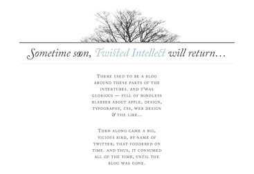
Examples of great design using little more than typography are virtually numberless. Some of the favorites I’ve spotted recently include designs by John Arnor G. Lom, Coudal Partners, and NB:Studio, linked respectively:
But of all the work I’ve seen recently, few have captured my attention as much as that of Veer’s Type City Prints. “Each portrays an urban facet, illustrated character by character with a typeface that evokes the image itself,” Veer’s website explains. “Illustrations are letterpressed onto archival, acid-free paper using brass dies mounted type high.”
Absolutely stunning.
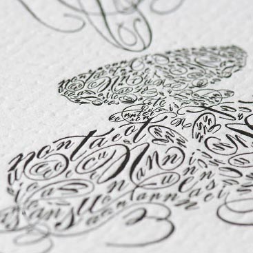
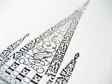
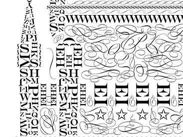
Inspired by Veer’s work, I had the privilege of creating a Type City-esque design of my own for an in-house poster contest. Designed in tribute to one of the buildings that adorn the organization’s headquarters (and one of the most compelling edifices in the state), the entire design was created solely with characters from the Bickham Script Pro and Engravers MT typefaces.
I’ll speak more about the design soon, but for now I wanted to share a few things learned during my first attempt to design with type characters. Luckily, in the course of my project, I was fortunate enough to correspond with Veer’s Justin Lafontaine, the talented designer behind the Type City Prints. (Correction: Christina Huber’s artwork is also featured in the set. Thanks Anders!) Below is shared knowledge from our experiences.
1. Use characters from the subject’s description. What better starting point and technique for conveying meaning than to use characters from the name of the building, location, object, or person? “The first thing I did was spell out the phrase, such as locations for the buildings, and copied it a few times at varying sizes in both upper and lowercase,” Justin explains. “This gives you a really good palette to start from which you can quickly grab different sizes depending on what you need.” (Regrettably, I learned about this tip only after I had made substantial progress, and therefore my design uses random characters and lacks that extra bit of meaning I could have given it.)
2. Take advantage of symmetry for both speed and beauty. For objects or buildings that are symmetrical, use symmetry to your advantage for creating the design with less effort. As Justin describes, “I usually built one side, then flipped it to complete the building.” As a result, symmetry also enhances the aesthetics of your work. “The symmetry in these can be pretty beautiful.”
3. Scale the characters to convey perspective. Justin: “In lots of them I used the scale of the characters to give the illusion of perspective, like larger characters closer to you, and smaller as they become further away. That helped a lot!”
4. Repeat sections whenever possible. This is probably the most important tip. You’ll find sections of the piece which you’ve meticulously built can be copied and pasted elsewhere in the design, and the duplicated section isn’t really perceptible without closer inspection. This is a real time saver. “All you need to do is some minor swapping, and it looks like a totally new texture,” Justin adds.
5. Don’t attempt this in one sitting. I take it back — this is the most important tip. Not only is type character designing extremely time consuming, it’s also monotonous work that requires a constant zoom in, zoom out dance to get things right. My design required a total of about 16 hours to complete. That’s just two full-time days worth of work, but don’t even attempt to do it two days back to back. Spread it out over a couple weeks to allow adequate time for correction, detailing, and simply to give yourself a break. (Mine was spread over three weeks.)
In retrospect, type character designing isn’t for the faint of heart, but it’s extremely gratifying if executed well. (A big thanks to Justin Lafontaine for sharing his advice!)
24 Comments
Stock photography, type, and killer tees. Genuinely recommended by Authentic Boredom.
Excellent article Cameron. I completely agree and work hard to convey my message solely with typography when I can because of the impact such designs have when executed correctly. It’s also the reason I started Typesites. :)
Absolutely love the Veer posters, I think I may have to place an order for one today…
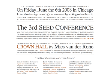
Excellent post Cameron! These are amazing!!! I really like what seedconference has done with HTML & CSS.
this post is so attractive! I saw the seed conference one a couple weeks ago and it sparked my typographic juices!
Beautiful work on Cameron! Care to share the complete image?
Gah. Should have been: “Beautiful work Cameron!” Even previewing doesn’t help a tired brain sometimes. ;)
Holy Shamoly that’s beautiful.
Really beautiful, Cameron. Thanks for the inspiration!
Care to share the complete image?
Soon, yes.
I was blown away by the simplicity, minimalism and the direct impact of the seed conference website. I haven’t seen as elegant an illustrative type work as the creations in Veer’s Type City gallery.
But honestly, what I found most profound was the music used on Veer’s Type City gallery. Simply superb, beautiful and elegant.
Interesting - I was recently encouraged by my boss to do a similar project. He loved the Veer Type City designs on my desktop.
Now, thanks to your direction, I might give it a try.
The Veer work reminds me of a piece I saw at our gallery of modern art a while ago which was a 8-foot high traditional Chinese-style sketch which had been made up completely of tiny Chinese characters.
Please tell me you would consider selling your letterpress temple print…
Some of these are quite reminicent of arabic calligraphy. Geometric patterns are at the core of a lot of art in that part of the world due to restrictions of visual displays of people, etc. An example is here: http://www.islamicarchitecture.org/art/images/calligraphy/islamic.calligraphy10.gif
Please tell me you would consider selling your letterpress temple print…
Actually, yes. Details soon.
Its nice to see the details. I’d also like to hear more about the letterpress aspects of the project…taking it from concept on the computer to the finished product.
Ha, that’s actually article #2, John. “Soon” seems to be the word of choice for my replies to this article…
For a fun take on designing with type characters, check out this new PBS kids show WordWorld, and the YouTube video.
It’s not quite the same thing as these, but you might find this interesting, too:
Nice job Cameron—really great post. I got hooked on type after reading Pioneer of Swiss Graphic Design my freshman year ;).
Have you checked out Experimental Jetset? Their firm is almost exclusively working with type-only design solutions. http://www.experimentaljetset.nl/
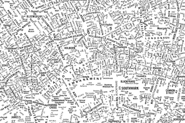
The “London’s Kerning” map by NB Studio is very similar to something I did for my own entertainment a few years back. I downloaded a PDF map of Dublin, opened it in Illustrator and removed everything but the street names. I’d love to try that with a world map too; since place names cluster around certain physical features (coasts and rivers, mostly), the map would probably remain quite intelligible.
Cameron,
I really liked your art work. What prorgram did you use to design these beautiful prints? If I had to guess, I’d say Illustrator.
Thank you for sharing your work.
Eric
This is something that can be incorporated into many different design projects for a lot of different results. Definitely something to get creative with
Details soon???
Authentic Boredom is the platitudinous web home of Cameron Moll, designer, author, and speaker. More…

Full-time and freelance job opportunities. Post a job...
A selection of fine reading, available for a limited time only:
- Recent job listings, testimonials, and 100th Kiva loan
- The ISO50 Field Guide to Color Management
- Upgrading the hard drive and memory in a refurbished 13" MacBook Pro
- Inspiring type: Libro di M. Giovambattista Palatino
- Randomness, vol. IX
 CSS Mastery: Advanced Web Standard Solutions A solid round-up of indispensable CSS design techniques by Andy Budd, Simon Collison, and Cameron Moll.
 Mobile Web Design A guide to publishing web content beyond the desktop. Tips, methodology, and resources. Now available.
![]() Letterpress Posters The unassuming beauty of a freshly letterpressed print.
Letterpress Posters The unassuming beauty of a freshly letterpressed print.
![]() That Wicked Worn Look. Techniques for that worn, aged, distressed look.
That Wicked Worn Look. Techniques for that worn, aged, distressed look.
![]() Mister Retro Machine Wash Filters Turn the dial to “Instaworn” with these filters.
Mister Retro Machine Wash Filters Turn the dial to “Instaworn” with these filters.
![]() Blinksale Dive in and enjoy shamelessly easy invoicing from Firewheel Design.
Blinksale Dive in and enjoy shamelessly easy invoicing from Firewheel Design.
![]() Basecamp My preferred web app for internal and client project collaboration.
Basecamp My preferred web app for internal and client project collaboration.
![]() HOW Conference Austin, June 24–27. Pentagram, Adobe, P&G, et al.
HOW Conference Austin, June 24–27. Pentagram, Adobe, P&G, et al.
![]() Web Design World Seattle, July 20–22. Practical sessions on web design.
Web Design World Seattle, July 20–22. Practical sessions on web design.
![]() Stimulate Salt Lake City, September 2009. Entrepreneurship and design conference.
Stimulate Salt Lake City, September 2009. Entrepreneurship and design conference.
Linkage:
Follow me: ![]()
1 Luke Dorny ~ 15 April 2008
This is so great and un-boring.
When i saw the Seedconference.com site i nearly dropped to teh floor like a wetnoodle.
Thanks for this post.