The new msnbc.com: Designs we left behind
~ 14 November 2007 ~
UPDATE: Upon request, I’ve linked the image showing my notes and the screen that followed.
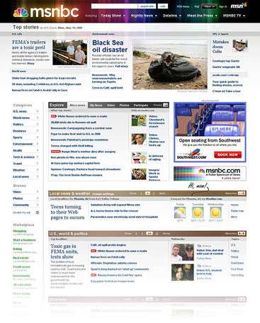
If you haven’t paid it a visit already, the new msnbc.com is worth a look. Nearly two years of research, planning, iterative design, and development went into this behemoth overhaul. It isn’t merely a redesign with a more lively, vibrant brand, but a genuine realign that thoroughly repositions the website as a separate entity from the cable channel, among other things.
This redesign is of particular interest to me as I had a minor role in shaping the outcome. Creative director Ashley Wells offers an in-depth, behind-the-scenes debriefing of all things design in his post-launch commentary titled “Designs we left behind,” in which he mentions my role as well as that of Greg Storey and JD Hooge. I won’t reiterate Ashley’s account, but I will offer a few details about the role I played.
Ashley approached me nearly a year ago with an offer to fine-tune a design his team had been working on. Seeing how I almost took a position with them (more about that here), I’ve maintained a working relationship with Ashley’s crew and therefore jumped at the opportunity.
When I’m given the chance to offer design critique and enhancement, I do my best to become cognizant of every detail, knowing a body of work is undeniably greater when each individual element is at its best. I’ve said before details a great designer maketh, but I’m certain we can all agree details a great design maketh, as well.
To assess the details of the design I was provided with, I spent time pouring over the Photoshop template, eventually printing a copy and filling the margins with notes regarding improvements to the hierarchy, typography, and iconography — all of which were minor enhancements to what I felt was already a very solid design.
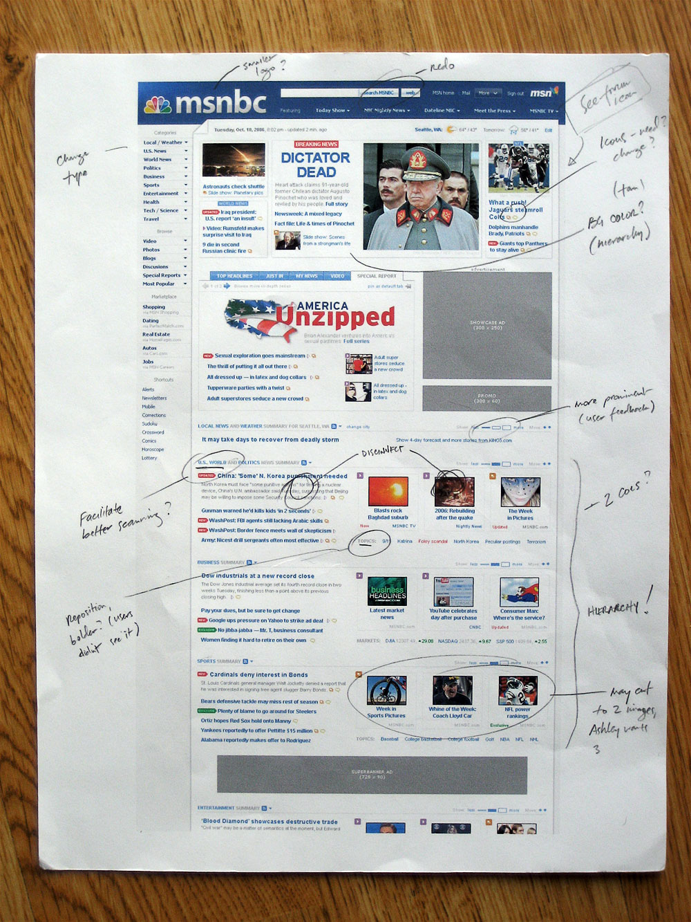
My enhancement, therefore, doesn’t appear to be earth-shatteringly different. A few aesthetic adjustments and type changes were implemented, while the largest changes altered the lower fold to improve hierarchy and to create a better snapshot of the day’s content higher on the page.


Obviously, the new version published last week is a good deal different than the original design, but such is the path of a year-long iterative design process influenced by new thinking, a major media campaign, and so forth. I really like what I see. The new version is an incredible improvement and an impressive body of work, to boot. Further, aside from all the embedded scripting and CSS, which is likely a result of the CMS or other three-letter curse word, the code under the hood is pretty clean. (Although a DOCTYPE might help, guys.)
Compliments to Ashley Wells et al on a stunning makeover.
24 Comments
Stock photography, type, and killer tees. Genuinely recommended by Authentic Boredom.
I had MSNBC as my home page until the advertising became overwhelming. I wrote to them about my signing off due to the obtrusive ads — never heard back. Will give it another try. Congrats on having a hand in such a high profile project CM.
Interesting behind-the-scenes insights, Cameron. Thank you for allowing us to see some of the process that went into choosing the design.
Looks really good. Although those dropdowns are insane. I’m sure you didn’t have to do with that though, maybe.
Does anyone else find the design that Cameron gave critiques on MUCH cleaner/simpler than the design used.
Now I understand MSNBC new marketing campaign is to use the entire rainbow as a color palette, which is fine, but the layout and design of the new site looks like dozens of individual design elements smashed together instead of a true “integrated” design.
It seems like people are giving it more praise simply because they were briefly involved with a massive redesign on a major site and not being objective about stating that the new design is actually *worse* than some of the initial design comps.
Sweet layout…very nice on the eyes
I have to chuckle - sorry.
The HTML behind this thing is dizzying. Firebug is throwing up all kinds of warnings - especially in regards to repeated IDs.
My favorite is the “Disable Fly-out” option at the bottom of the left-side menu. Adding this must have been a very difficult decision. Someone somewhere got into a pissing match and lost.
I like to imagine it went something like this…
Important Man: “We should have fly out menus that are better than anything that has come before.”
Busy Worker: “But getting them to work well in all browsers is tricky and most people don’t even like them.”
IM: “I’m sorry but I couldn’t understand a thing you said what with all the crying and mumbling that you were doing. Make it happen.”
* some time passes *
BW: “I’ve spent months getting these menus to work in IE, Firefox and Safari. I even got it to work in Opera even if it’s a little slow to respond. No one cares about Opera so we won’t even mention that it’s supported. We probably shouldn’t even mention Safari.” (see: http://www.msnbc.msn.com/id/6901603)
IM: “These menus are insane! How can anyone be expected to use these things?”
BW: “But you said you wanted them.”
IM: “You really must stop crying all of the time. No one can understand you. Put a button on the side so I can turn these damn things off.”
If an option exists to turn something off on your web site ask yourself if it’s even necessary then (Flash mute buttons and “Skip Intro”)
The site looks nice which it’s an improvement. The team did a fine job on that front.
I’ll save my other thoughts about such things as having an anchor class called “linkBlack” and the lack of unordered lists (I’m looking at you “MORE FROM TOP MSNBC HEADLINES”) for some other place and time.
Appears that they did not add DOCTYPE to the code. Is there a reason for that?
I like the new look, much better then then old. Congrats Cameron!
Two years of research.. and it uses flyout menus??? omg
The embedded css/js code is probably more for performance reasons, rather than a crappy CMS.
Excellent work, Cameron. I’ve been enjoying the new MSNBC design since it’s release, and in the back of my head had wondered if you were involved in some way. Much of what I like about the new site reminded me of your work. MSNBC has come a long way in the past several years and it’s neat to hear a little about how it’s all come together. Thanks.
I don’t see any any flyout menus. Am I missing something?
It always amazes me how much content they fit into these websites. How many links do you think they have on that 1 page alone?
@Michael McCorry
The links next to the logo!?! Beneath the search box.
> It always amazes me how much content they fit into these websites. How many links do you think they have on that 1 page alone?
As I recall the finished rendered page would have 200+. Madness.
Okay I hate to trash something that obviously took a ton of work to put together, but there’s definitely some issues…
First of all its pretty… my complements to the designers on the graphics. I especially love the weather elements.
However… EEEK!!! Those flyouts! They’re so sensitive and there’s so many of them it seems hard to browse the page without accidentally mousing over them. On top of that, they duplicate navigational content that’s already provided in the main body. And “Disable Fly-out” is a cop out. Obviously they know there’s usability issues with the flyouts, otherwise they wouldn’t provide the option. Either make the flyouts show only if I hover over the actual arrow for a full second or two, or get rid of them completely.
Also the content looks great above the fold, but below that it lacks the feel of a natural rhythm. Its got too much whitespace between related elements it becomes very blocky. It gets even worse when you dig deeper into the site.
Looking at the photoshops you put up Cameron, it looks like they had a much better design before.
Frankly, I think The New York Times and The Washington Post still do the best job of presenting a live news site. They fit a TON of content on their front pages without feeling too cluttered, overwhelming or blah. They use proper proportion of feature stories to non-feature stories, headlines to teaser text, etc. They change the column layout multiple times to keep your eyes moving down the page. They feel tight & organized but not cluttered and overwhelming.
What’s a DOCTYPE?
Cameron, I think your design concept is far-and-above better then the end result. It’s so much cleaner, more organized and professional.
I like aspects of the final product better, but one thing that I really wish they would of stuck with is the header image from the one you are showing. Also I really enjoyed that folded edge at the top left side.
Other than that it seems that they made some positive changes.
you can disable the flyouts - see the bottom of the left navigation on the home page (right above ‘marketplace’)
Understanding the thinking of an Interface Designer is one thing, being demonstrated their thinking patterns with specific projects is a gem.
Thanks for sharing the layouts and thinkings of this superb design Cameron.
I’m not a big fan of the msnbc site myself. Seems like there’s too much information cluttered in a small space. But is good to hear that such sites are actually paying attention to layout of their pages.
new website design has improved in the days following its original release. At least the designers seem to have got rid of that awful banner ad at the top of the screen.
However I still think its more of a mash-up than an integrated whole. The last design was more solid looking and worked just fine.
For those with extra fast connections, using MSNBC as a home page provides justification for the new look as it is more interactive.
Still for me, its not a huge improvement and if anything, I prefered the last design.
It seems like people are giving it more praise simply because they were briefly involved with a massive redesign on a major site and not being objective about stating that the new design is actually *worse* than some of the initial design comps.
Authentic Boredom is the platitudinous web home of Cameron Moll, designer, author, and speaker. More…

Full-time and freelance job opportunities. Post a job...
A selection of fine reading, available for a limited time only:
- Recent job listings, testimonials, and 100th Kiva loan
- The ISO50 Field Guide to Color Management
- Upgrading the hard drive and memory in a refurbished 13" MacBook Pro
- Inspiring type: Libro di M. Giovambattista Palatino
- Randomness, vol. IX
 CSS Mastery: Advanced Web Standard Solutions A solid round-up of indispensable CSS design techniques by Andy Budd, Simon Collison, and Cameron Moll.
 Mobile Web Design A guide to publishing web content beyond the desktop. Tips, methodology, and resources. Now available.
![]() Letterpress Posters The unassuming beauty of a freshly letterpressed print.
Letterpress Posters The unassuming beauty of a freshly letterpressed print.
![]() That Wicked Worn Look. Techniques for that worn, aged, distressed look.
That Wicked Worn Look. Techniques for that worn, aged, distressed look.
![]() Mister Retro Machine Wash Filters Turn the dial to “Instaworn” with these filters.
Mister Retro Machine Wash Filters Turn the dial to “Instaworn” with these filters.
![]() Blinksale Dive in and enjoy shamelessly easy invoicing from Firewheel Design.
Blinksale Dive in and enjoy shamelessly easy invoicing from Firewheel Design.
![]() Basecamp My preferred web app for internal and client project collaboration.
Basecamp My preferred web app for internal and client project collaboration.
![]() HOW Conference Austin, June 24–27. Pentagram, Adobe, P&G, et al.
HOW Conference Austin, June 24–27. Pentagram, Adobe, P&G, et al.
![]() Web Design World Seattle, July 20–22. Practical sessions on web design.
Web Design World Seattle, July 20–22. Practical sessions on web design.
![]() Stimulate Salt Lake City, September 2009. Entrepreneurship and design conference.
Stimulate Salt Lake City, September 2009. Entrepreneurship and design conference.
Linkage:
Follow me: ![]()
1 Nik ~ 14 November 2007
I am not a regular user os the MSNBC site, mostly because it always felt too cluttered. It’s great to see major websites pay more attention to the presentation of their web content, as it is players like these that you need on your team to win the Standards Game.