Design’s elusive “final ten percent”
~ 29 January 2009 ~
With every design effort, there’s a point at which we become satisfied with what we’ve produced, and we can either terminate the iterative process or refine one final time. I’ve yet to figure out what to call that point, but the best I’ve come up with is “90 percent”.
Framed in terms of satisfying consumer needs and our own desires for a finished design, it’s the point at which we can either stop at 90%, or continue on and get as close too 100% as possible. Often, I’ve found the detailing that comes after 90% can make a big difference in the overall success of the design.
Prior to posting the new design for Authentic Jobs, I knew I was at 90 percent-ish. I recognized it after a conversation with Suzanne the night before posting it. But I wanted to hear from others whether or not my assumptions about what was lacking were correct.
You all confirmed they were, and you pointed out a few other important things along the way. Here are a few of the common themes that emerged.
Search area needs finessing
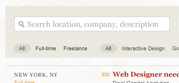
Comments included adding more contrast and color to this area to help ground the page, making the category labels larger and allowing room for the addition of new categories, and allowing for filtering by location. In general, the response is positive to adding search and filter options to the site. (Um, duh, Cameron.)
“Post a Job” box needs better organization

Lots of dissenters here. From the color of the button to the organization of each element, in general the feedback suggests this box needs some serious lovin’.
More contrast needed overall

Several of you stated you’ll miss the dark masthead, the leather texture, and the red/beige color theme. This one I don’t totally concur with. I recognize the contrast levels are less elaborate in the new design, but for the most part I’m okay with that. After all, part of the aim of this new design is to reduce the contrast of the masthead and place more visual emphasis on the listings. I do agree, however, that it’s not there yet.
And that returns me to the point of this post.
You won’t ever reach 100%, nor should you try. I call that final ten percent “elusive” for a reason — quality and utility will inevitably yield diminishing returns at some point. (See #2 on Eight Things.) But it is in your best interest to push through the final one, two or even nine percent after you’ve hit 90. The ability to recognize when you’ve hit 90 percent — and knowing when to stop thereafter — is a skill that I’m certain takes a career to develop.
Anyhow, thanks for the excellent feedback. I’m off to see how close to 100% I can get with this design. I probably won’t post another screen until the new site is in public beta, at which point all of you will be invited to kick the tires on it.
16 Comments
Stock photography, type, and killer tees. Genuinely recommended by Authentic Boredom.
It’s interesting to hear the feedback that you’ve received about Authentic Jobs and how you plan (or don’t plan) to address it.
It’s interesting you posted about that elusive 10% today. I just walked out of a lunch-and-learn session at the company work for where we talked about work flow and our build process. One of the things we discussed was how the first 90% of a project is typically on schedule and then the last 10% sometimes takes almost as long as the first 90 did. It’s awesome to get those finishing details in there to make a better product, but it’s also important to know when to say when and boot a project out the door.
I already updated my resume to include “Art Direction for Cameron Moll”
Brilliant :)
Cameron,
I digs. Awesome work.
Thanks!
Thanks for this post, good points of discussion, I have been trying to wrestle that last 10% on a couple of projects.
I definitely like the direction of the site, and am looking forward to the beta.
This works the ‘other’ way as well, as I would tell my Photoshop class… there’s always one more thing you can do to an image. Gotta know when to stop!
You have skills , i like your design, this is the second time i have found your blog some how through a link on the internet . Good work.
Cameron, I’m curious if you do any A/B performance testing when you are working on a new design.
If you haven’t, I think you’d be absolutely fascinated with the results. 37signals has recently been blogging about some of their discoveries and the results have been quite eye-opening.
http://www.37signals.com/svn/posts/1496-design-decisions-the-new-highrise-signup-chart
http://www.37signals.com/svn/posts/1508-design-decisions-saying-more-in-less-space-on-the-new-highrise-site
The biggest problem with the final 10% is you get to a certain point and tweaking a color or font size can become the focus of your revisions when really, does it matter? Is there a direct correlation with the font size of your footer links to your conversion rate?
By the way, I love the new design and I don’t think you need more contrast, it’s great as is. However, I do think the ‘post a job’ section is a bit of a mess. That’s all I would do to change it.
Nice job on the redesign Cameron. I agree with most of the feedback you received. Besides all the little changes, I will miss the strong contrast elements of the old (current) site. But that’s just designer preference. Awesome job as usual. Thanks for sharing.
Great article and really liking the new site design. Thanks for info in this writing!
I agree with you on making the masthead less of a focus. Keep it simple and I like the wider design too. I think it’s looking really good and I can’t wait to see it in its beta stages!
Interesting comments about contrast. Something I find consistently problematic is designs that don’t meet basic accessibility needs. Aesthetics are important but I’ve seen many sites that were unreadable. There’s definitely a balance to be found.
The thing is, contrast is not actually subjective - there are simple tools which tell you if the contrast meets W3C accessibility requirements (http://www.paciellogroup.com/resources/contrast-analyser.html).
I always say: there’s the first 90% percent on a project, and then there’s the next 90% of a project ;-)
This does not hold for webdesign projects only I suppose, but for every bit of effort you put your heart into.
In fact, well, in my humble opinion anyway, The ‘2nd 90%’ actually is where you make a difference between ‘good’ and ‘absolutely excellent’.
Authentic Boredom is the platitudinous web home of Cameron Moll, designer, author, and speaker. More…

Full-time and freelance job opportunities. Post a job...
A selection of fine reading, available for a limited time only:
- Recent job listings, testimonials, and 100th Kiva loan
- The ISO50 Field Guide to Color Management
- Upgrading the hard drive and memory in a refurbished 13" MacBook Pro
- Inspiring type: Libro di M. Giovambattista Palatino
- Randomness, vol. IX
 CSS Mastery: Advanced Web Standard Solutions A solid round-up of indispensable CSS design techniques by Andy Budd, Simon Collison, and Cameron Moll.
 Mobile Web Design A guide to publishing web content beyond the desktop. Tips, methodology, and resources. Now available.
![]() Letterpress Posters The unassuming beauty of a freshly letterpressed print.
Letterpress Posters The unassuming beauty of a freshly letterpressed print.
![]() That Wicked Worn Look. Techniques for that worn, aged, distressed look.
That Wicked Worn Look. Techniques for that worn, aged, distressed look.
![]() Mister Retro Machine Wash Filters Turn the dial to “Instaworn” with these filters.
Mister Retro Machine Wash Filters Turn the dial to “Instaworn” with these filters.
![]() Blinksale Dive in and enjoy shamelessly easy invoicing from Firewheel Design.
Blinksale Dive in and enjoy shamelessly easy invoicing from Firewheel Design.
![]() Basecamp My preferred web app for internal and client project collaboration.
Basecamp My preferred web app for internal and client project collaboration.
![]() HOW Conference Austin, June 24–27. Pentagram, Adobe, P&G, et al.
HOW Conference Austin, June 24–27. Pentagram, Adobe, P&G, et al.
![]() Web Design World Seattle, July 20–22. Practical sessions on web design.
Web Design World Seattle, July 20–22. Practical sessions on web design.
![]() Stimulate Salt Lake City, September 2009. Entrepreneurship and design conference.
Stimulate Salt Lake City, September 2009. Entrepreneurship and design conference.
Linkage:
Follow me: ![]()
1 chris ~ 29 January 2009
thanks for sharing your insights and your new upcoming design, its interesting for me to see how you plan/think about it all.
btw, love the new design :)