Design Review: Your chance to critique me
~ 27 January 2009 ~
Routinely I’m afforded the opportunity to put my money where my mouth is when it comes to redesigning vs. realigning. However, not since July 2004 have I done so in a forum so public as this. Here goes…
Through customer feedback and my own observation over the past several months, I’ve identified a number of enhancements necessary to improve the design and layout of Authentic Jobs, most notably the home page. These improvements, such as the addition of search and new categories, have also given way to an opportunity to update the identity and aesthetics of the site.
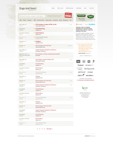
This new design is still a work in progress, but it’s complete enough to begin gathering feedback. Given many of you are current or potential users of Authentic Jobs, I can’t imagine a better audience to gather feedback from.
Feel free to comment on whatever, no holds barred (except the logo, which isn’t complete enough yet to be included). At a minimum, I’d like feedback on:
- Visual hierarchy — is what’s most important displayed as such?
- Job categories (just above the first listing)
- Typography — size, color, weight, etc.
- Overall look & feel
Lastly, how does this updated design address (or not address) your needs as a job seeker? As an employer, Is the purpose and function of Authentic Jobs quickly and easily discernible?
Please, with haste and earnestness, fire away.
(And if you’re an employer, take advantage of promotional pricing through January 31: Use promotion code MOLL09 to receive $125 off the purchase price of a full-time listing. Use FRLANZ09 for $25 off a freelance listing.)
84 Comments
Stock photography, type, and killer tees. Genuinely recommended by Authentic Boredom.
I love it. As long as searching for “Boston” or “Massachusetts” will return accurate results, I’m thrilled.
As always, your work is an inspiration for the rest of us.
I like the header of the current design the best, but the new listing interface is much more cleaner. Nice work!
Nice design. I have to scroll horizontally to read it all though.
Well for starters, I love Authentic Jobs - it got me my first and current design job for a company called YouCastr and for that I’ll be forever grateful.
As for the redesign, it’s looking fantastic! One quick thing I notice right off the bat is the background image repeats, and on my 1920px wide monitor it looks a little out of place when that grunge texture shows up on the right side of my browser window. I’d just set the background to no-repeat.
In terms of usability, I’m not quite understanding why certain job titles are grayed out. My first assumption would be that the position had be filled but that doesn’t make any sense because that listing would no longer have a reason to even be there. Maybe a better explanation somewhere/somehow. I also think the dates could be a little more prominent. It’s obviously easy to sort through once you find them but It took me a few seconds, and in my opinion there’s no real reason to subdue them quite so much. maybe just black text or a hair bigger.
I’ve always liked. and now more so, the “come in we’re hiring sign.” It just seems to fit perfectly stylewise and placement.
The navigation is exceptional. two words quickly come to mind: beautiful and elegant. While both are routinely tossed around in our industry they definitely apply here. Nothing but the necessary and seemingly simple to use, I’d love to see the hover.
I also like the mixings of sans serif and serif fonts. Any site that pulls that off well has an A in my book. The overall feel definitely maintains that professional, organized, and sophisticated feel but it’s got a touch of down to earth comfort and all those seem to compliment the site’s purpose very well.
All in all fantastic job, can’t wait to see it live!
This is obviously a static screen grab, so ignore for now some of the smaller details that’ll go away when it’s coded, e.g. horizontal scrolling.
I see no problems in the overall layout. However, in terms of typography, i think there’s too many different fonts going on. Not enough to deviate attention from the subject matter (which i guess is the most important feature), but enough to jolt the attention of the “typographically sensitive”.
I also like the fact that there isn’t a barrage of advertisements
I constantly go to authenticjobs.com for work—thanks for adding the “date added” information. I always had a hard time determining on the homepage how old some of the posts were.
The Post Job and 100% Guarantee compete with each other too much I think.
I like it, but I think the “Post a Job” button should be a bit more pronounced and might do well with more contrast.
It kind of blends into the ads and for awhile I thought it was another ad. Maybe removing the background and making the “post” button contrast with the rest of the site would help draw a user’s eye to it.
The only other suggestion would be stronger headers for the dates. But I’m not too confident about this advice, so take it with a grain of salt. Maybe if you separated the dates of when the jobs were posted better, it would help break up the monotony of the postings a bit.
The design is very clean and typographically strong. Nice work.
The new design is more inviting and cleaner.
Great redesign! I look forward to the launch.
Cameron — how’d you like to post your design to PleaseCritiqueMe.com It’s a service I started where a professional designer will critique a design upon request.
Tony
It comes off a little stark to me, Cameron. There is nothing grounding the viewport- the browser background is so light that it’s pretty much a non-player. I think this is just looking at it in contrast to the current design with the rich dark red color. Interface looks great though, nice improvements.
I love it. Very subtle and elegant.
The only thing I noticed about look&feel was $250 and $75 block under Post a job. They look like they are floating away to the right.
As for my needs as a job seeker it seems you’ve addressed them: selecting a category and Freelance at the same time (I can only work as a freelancer but I usually look for both Dev and Design).
I’m looking forward to updated design.
I like it. Although I am not feeling the contrast. Its very “grey”. Im not really feeling the swatch of grunge up on top left, It kind of dates the design a little.
Also I like how some sites keep the drill down info for the site with multiple visits. I mean I am a designer, so I rarely if ever need to look at the development gigs.
Also I think that the dates should be on each entry. Not just the first of the day.
Thats all. I like it though
- Jeff
Nice design Cameron, a couple of points I would like to add;
1. Either decrease the number of listings or add page navigation at the top of the listings as well as at the bottom
2. When searching for a term, it would be nice to be able to subscribe via RSS to the search term results, e.g. jobs in ‘London’, ‘ui designer’ jobs
3. Filtering by freshness/recency/position closing date would also be a nice-to-have
The new direction looks nice, but I do miss some of the heavier burnt orange colors. Many of the elements in the new design tend to have similar values (light gray, tan, and orange) and nothing seems to be anchoring it down yet. I wonder if bumping up the color and saturation for the main search bar and post a job shapes would help anchor the page more.
1. Visual hierarchy – I’m having a hard time finding what’s most important here. My eyes either keep going to the “We’re Hiring” sign or the newest job posted (in bold red). Maybe if the search bar area or logo weren’t as bland of colors, I could land there and figure out the site.
2. Looks like a great idea. What about other misc job categories. How will the misc button work? A drop down menu with other selectable categories?
3. Typography looks good. Love it.
4. Overall look is good, but maybe a bit bland. Punch up what is really important to help guide someone to where the starting point should be.
As a “job seeker” I think this gets the job done easily and well. Looks like it will be very easy to use.
Overall it feels like a natural progression from the current state, which is a good thing.
That said, I feel as though the :visited styles are a little overstated; they come off as disabled as opposed to just previously visited. Also, it’d be nice to retain the current functionality of select multiple job categories, even more so now that you have a greater number of categories.
Lastly—and I’m pulling teeth here—the “View All Testimonials” link in the sidebar is begging to aligned flush left with the featured testimonial and author.
Looks great otherwise!
Great work so far. A few comments:
Visual hierarchy —
Generally, I think your hierarchy is good, but you may want to rethink the “Post a job” area. It feels a bit Ad’ish. Your most important message is, “We have jobs,” and “Post your job cheap with a guarantee.” Those should be your highest priority hierarchically.
Additionally, is search what you want them to do primarily? If so, it needs more visual weight - it’s a bit too far back in the design to really tell me “Do this!”
Job categories –
I like the idea. What happens when you have more categories?
Typography —
I generally like the concept of mixing serifs with sans-serifs, but there doesn’t seem to be a terrible amount of consistency there - it feels that you are arbitrarily mixing them.
Overall look & feel –
I like the color scheme, layout, and general look/feel - but the one area I would go back to - at least for me - is the visual hierarchy and weight. It’s very subtle and lacks contrast (not necessarily a bad thing) but you need to offset the lack of contrast with a strong hierarchy and very logical flow.
But again, great work. I look forward to seeing the result!
All in all it looks great. My only critique is with the text hierarchy. The job titles pop well against the soft background, but the city/state listing and job type get lost in the background. I recommend bringing them out a bit more. When I go to AJ now I check out the job title, then freelance/full-time last I check the location.
One great improvement is bringing the green in the “Post A Job” box it’s noticeable and a nice compliment to the jobs listed.
First of all I like the design. Here are some of my thoughts - feel free to use or disregard any or all of them :)
* think how you’ll manage more than 6 categories - another one might pop up tomorrow :)
* it might be a good idea to label the two search criteria (type, categories). Ignoring the fact I know what the page is about I could have problems understanding the preselected “All” criteria.
* there is no visual separation (besides text on the right) of jobs posted on different days. Maybe you decided that timestamp is not so important but I think it might help visitors to quickly see today’s (latest) jobs
* using the same color (orange) for Full-time job and New items is somewhat confusing
* I’m guessing that bold jobs are those posted today? This is on a par with the “New” icon, right? I’m not sure if it helps me or makes me wonder what else could this mean.
* Front-end Developer looks like “everything else” to me - if its a rollover or visited link I’d use a darker color (closer to #666)
* Post a job button somehow looks less interesting than 100% guarantee. I’m guessing it’s because of the texture and stronger green used. This area also seems a bit unbalanced.
* is there a link below the about us text in the sidebar? If the title links somewhere it’s not obvious enough.
Well that would be it. As I said - the site looks nice and clean. Consider above items as suggestions and my personal view of the site and not critiques :)
@ Fred Yates: Greyed-out job titles are links you’ve clicked on (a:visited).
@ John Leschinsk & Ryan Merrill: Good feedback re: “Post a Job” box. That’s been a veritable thorn in my side, and I’ve apparently still not nailed it.
@ Chad Crowell, Jeff Witters & Craig Minch: Regarding contrast, would a splash of dark color to the search box / categories area help “ground” the design?
@ Jordan Wollman: I’m hopeful these categories remain for a while. Adding even one more would require rethinking the design, obviously. But if I can get it right now, it’ll stay for a while.
I’m wondering if the new table will be sortable? When I’m searching for jobs, I like to have the option of at least sorting by date, so I can see the most recent postings quickly.
Also, I agree with Jeff about adding the date to each entry.
Love the search box, categories, and top navigation. Great job!
Once you scroll down the page gets very monotone. This is function not design but would love to see a “more” info option without having to click to the next page.
I like it!
Regarding the grayed out listings, I was unsure about these as well. Do they mean the job has been filled? If so, I think that’s a great function, assuming those listing the job update them. I’ve never posted a job before, but I use it to look for jobs often, and I ignore older listings because I figure I’m too late to bid for a job if it’s a month old listing.
I think that keeping it grayed out is a better idea than deleting it entirely as was suggested earlier, because I might come back looking for the listing and wonder where it went if it was simply deleted.
The job categories at first seemed a bit too restrictive to me, but the more I think about it, they seem logical.
And one final note, I think the color of the “Additional options appear here” could be more brown and less gray, and also slightly darker.
Looks great overall!
Looks good, but the use of small/grey text in serif font looks fuzzy to my tired eyes. I’d say use a more contrasting grey, or increase the font size a couple of notches :)
I like the new idea for the layout, but I liked the older color scheme of the reds a lot better.
It’s very well organized and clean, but doesn’t feel as well branded as the original design. I miss the dark header and rich colors.
The added functionality looks dyn-o-mite. While the site is totally elegant (grayed visited job listings are perfect) and the visual hierarchy is stellar (my eye goes from ‘come in we’re hiring’ to ‘post a job’ to the latest job listings’) , it seems like you’ve lost some of the personality of the original.
Can you talk about your decision to lighten everything? The visual brand of the original was uniquely Authentic Jobs. Now it looks a bit more generic and has lost some of its identity (pun intended :-).
Hi Cameron,
I really like where this is going. Having been a job seeker on Authentic Jobs before, I remember my frustration with not being able to filter by location. I’m happy to see the search box added!
My only concern would be the “categories” that you’ve added to the search criteria. It doesn’t exactly provide for extensibility if you were to add new categories or have to change them in the future unless you were planning on expanding to a new row. To be honest, I find many employers confuse some of those terms most of the time, (For example, the difference between “interactive design” and “development”). For me, personally, a location select box (or simpler, more generalized categories) could be a better fit here.
I love the layout - all the information I need as a job seeker or poster are right where I’d expect them. The typography work is great - I find it clear and easy to distinguish between bits of information. The tiniest niggle - The line-height of the text under the RSS and Twitter links feels a bit tight to me.
I do miss the red contrast of the previous design a bit, but this is still clean and easy to read. My only color issue is with the “100% Guaranteed” and “Add a Job” buttons. The “Post a Job” button seems a bit out of place without any texture behind it (since all the other graphics are so beautifully detailed), while having them both the same color makes them blend together a bit for me.
It takes a brave person to open up a design critique to the general public, so thanks for letting us see your work in progress! I’m looking forward to seeing the final product.
I’m wondering about your decision to lighten everything as well. To me it does feel a bit more generic, like others have said. But also in my unscientific tests, my eyes seem to just snap to and rest at the additional search options area. I end up going right over the nav and logo area, and to a lesser extent I even have trouble focusing on the job listings because they’re all the same shade of light gray.
That’s one thing I liked about your previous (current) Authentic Jobs site, and this site as well. A strong header that commands attention.
Very beautiful and elegant! Will be looking forward to looking for my next new job once you get that baby up.
I’m with @ryan Merrill on the Post a job button though… it doesn’t look quite like it fits in. Also, I’m sure you didn’t put a search button in there for a reason, but my mind will want to click “find” or something in order to search.
I think you’ve done a good job putting focus on the actual jobs rather than the navigation… it means that not everything is screaming out at you at the same time.
Good luck with the rest of it. It’s better than anything I could have done :)
Concerning the thorn in your side:
The 100% guarantee is nice little graphic but seems to be causing some of the spatial awkwardness. MIght be easier to stack the elements in that container. So “POST A JOB” would be the full width of that container, prices would be underneath in a row and then a horizontal treatment of the guarantee graphic. Not sure if this is a solution but just my $.02. Keep up the great work!
To echo some other comments, the low contrast is eye straining on poorer quality screens - many laptops I see are at factory default contrast/brightness/color settings and those users would struggle with things like the arrow indicator under the main navigation area.
I love the new direction your taking with the redesign of AJ. Here’s my critics from a user interface perspective:
- For the search location, company, description field, where’s the submit button? Is it ajax where it’ll automatically update the list below? Or do you simply press enter? I’m not sure. My eyes keep looking at the “Post a Job” button since it’s on the same vertical level. I think you should remove the text in parenthesis by the search field in place for a big button called “filter” or something in that nature.
- As far as the contrast is concerned, it looks like “Post a Job” is trying to take the visual prominence away from the search field with the graphical background. Is that intentional? IMO, I’d apply the graphical background the other way around so that “Post a Job” feels secondary.
- I’m also assuming the background of the search field area and “Post a Job” are the maroon color as seen on the current AJ design? I think that color would really guide user’s eyes towards the two key design elements the user is encouraged to perform.
- Right under the “Post a job” area is the about section which doesn’t really call any eye attention. I think that the bold section should be styled with a serif font to keep things consistent with how the results section looks like.
- And finally, I think the results section needs a little more vertical padding so it doesn’t feel too stuffy. And as far displaying the “date posted” to the right, there should be dates for all entries. Maybe only show the dates posted when the user hovers over that listing? That should help reduce any signs of information clutter.
Hopefully that helps!
Beautiful as always, Cameron.
I’d like to see a darker background though (dark red would be very nice). I feel it would help keep the focus on the content.
Also, I’m a little confused about the link colors. I see red and bold red. What’s the difference?
The “Post a job” box really doesn’t jive well with me. I don’t see it as being a “seamless” section of the site, it kind of gives off the impression it’s an unfinished background image.
Maybe because the rest of the “foreground” is clean and sharp, while this one small box (with no visual cue on why it’s there) looks like a hole is cut to show the page’s background with full contrast but has no visual depth.
Does that make sense? I don’t really know how to phrase it, sorry.
Other than that, the rest of the design is sharp and I like the muted tones a lot.
Cheers, always enjoy reading your posts!
As always your work is so gorgeous that it’s an inspiration for the rest of us.
But I do have a couple of comments. First I think that it might be nice to label the job categories as such. We know what they are but somehow it feels with this design like there’s an inherent assumption that the user knows what the site does. Even though most will I still think it would be better to just spell it out directly. I might say Full Time Jobs | Freelance Jobs and then specifically label job categories.
I feel that between the Post a Job button and the 100% Guarantee graphic that there’s too much green in that right area. And maybe the Come in We’re Hiring graphic is a little too close to the other two graphics? I know that once the logo is in the balance will change but right now you’ve got lots of graphics over on the right.
The Twitter graphic is also quite large, I think it’s strong enough that it could be smaller, with more negative space around it and still have the same impact.
I think the typography is excellent except for one bit of text. The text “Authentic Jobs is a targeted…” feels like it needs a different text treatment, it doesn’t fit in some how, to bold, not classy enough, something. It looks like it was just stuck there when in reality it may be the most important element on the page for some users. Perhaps it needs a divider between it and the text below, or a bit of color?
It feels very odd to critique someone’s work when it’s so much better than my own. But they say it’s easier to be a critic than an artist.
Hi Cameron,
I love your work, and have been following you now for a few years. (Jeeps aren’t swimming pools…)
As bizarre as this may sound, the new version seems a little bit of a step back.
Some have already mentioned the search bar - to me it feels like its in the wrong place. perhaps putting it under your “Freelance|Fulltime etc.” links would work better. Making those links/tabs more obvious would help. I was a little lost at first.
The tab mechanism that you have on the current site to me just works. It’s obvious, simple and straightforward. The new version I have to think a little more as to what exactly it is I want to be doing.
When looking at the current version, I go “Oh, there’s a search bar…where are the job listings? Ah… there they are… why can’t I see them? Are they combined? Separate? what happens if I click on this… a new page? Is there a difference between the Full Time and Freelance, vs. Each independent category item? Can each independent category be full-time or freelance?
Your top navigation is obvious, but it too, like the search bar feels uncomfortable. Perhaps having it run across the top of the site with the logo underneath?
As someone mentioned earlier, the green post a job and 100% guarantee look too “Addy”. It feels like you just tossed it in to the square. It seems, for lack of a better term…”unAuthentic”. Your current site feels better for this.
The sponsors or partners on the right feel a little sloppy. Two columns left-aligned might be a neater option.
For whatever reason, the new version seems a little cluttered or noisy. Can’t put my finger on why. For the new version, my eye initially goes to the red sign, then to the green, and gets stuck there for a moment…kind of grasps the main navigation, then eventually trails over to the search bar…at which point I wonder what I’m supposed to do here…it then registers that this is a job site. The last thing I actually see is the job listings, or the categories I can search.
Keep up the inspiring work - your initial Authentic Jobs is and has been a breath of fresh air to the “Job Site” market. It’s easy, straightforward and Authentic. Whatever happens, don’t lose the authenticity of the original idea due to some perceived market trends - “Post a targeted job - Find a targeted job” C’est Tout.
I like the look so far, especially everything being a bit lighter than the current layout.
I feel the “new” icon next to Today’s jobs is a little superfluous seeing as you have already highlighted them by making the job title bold and indicated they were added today.
But I like that you do indicate when the jobs were posted and also differentiating between freelance and full-time by using different colours.
Although I can’t get passed the “Post a Job” button as well as the “100% Guarantee” the style seems very out of place.
Overall I do like the direction things are going.
Looks very clean and organized. The only thing I have trouble with (and is the same with this site) is the type in the light grey is hard to read. (Maybe it is just that my eyes are getting worse…Central Serous Retinopathy)
Suggestion: take listings down once the job is filled. Also, maybe remind the companies that post there that it would be courteous for them to at least acknowledge receiving an initial contact from a job seeker.
Hello there.
I think it looks good.
My humble opinion: Maybe some subtle contrast between the right column and the main content will give the overall design a hierarchy, dividing the two main segments.
Greets.
I would simply echo what others have said about the absence of an anchoring color. Using maroon for the search area background might over do it, but it should at least be a darker shade than it is. Finally, why the green for the “Post a Job” button and the guarantee emblem? I expected red for the post a job button since your links are all red and that seems to be the dominant color in the design. For the guarantee emblem, maybe gray instead of green would keep it from competing with the post button.
All-in-all, it looks great though and I look forward to the new navigation options.
Haven’t had the time to review all comments, so forgive me if I have repeated something. Couple of things I noted:
1. Love the overall aesthetic of Authentic Jobs, and I think this is a natural progression from what you had. Nice!
2. From an accessibility standpoint, we would want a submit button on the search box, no? Or are you thinking live search?
3. What’s gonna happen to the categories when you add more? Seems like they were crunched in there and that could be a concern in the future that might need to be redesigned.
4. I think the delineation of the two types of categories, position type and job type, is lacking. Perhaps these need some label so that people coming in for the first time clearly understand these? I liked that the current AJ focuses on the first sorting by position type, and then by the categories. This design seems to put both on equal footing, and I’m not sure that’s how people would typically approach it. I know I go for freelance first right away, and then filter down to the job type I’m looking for.
5. Not necessarily from the view of the job seeker, but the CTA to post a job seems a little small and out of the way. I understand the focus is on the job seeker, but the balance there doesn’t seem to be working right now.
6. What additional options were you thinking about when you click on a category? If it’s dependent on the category chosen, should it be underneath it to show inheritance of information?
Overall, love the natural progression of the design elements - I just think there’s some fine-tuning of showing the IA through the design.
Hello Cameron,
I’ve been following your Boredom for sometime now and I greatly admire your work. And I have to say I envy your courage, I don’t know if I’d be able to open up my designs for anybody and everybody to judge, so well done!
I do agree with what some other people have said — the current header makes a much bigger impact and it’s far more unique. In a way, the whole page feels like a step back design wise. The new tools, however, will definitely help a lot, especially the search bar. As someone who has used the website as a job seeker, it would also be an enormous help if we knew for sure that all the jobs posted were still available.
Thanks for sharing!
I do like the new design - I will miss the more colorful styles you have currently, but welcome some updated functionality. A few comments I have are more with functionality than design:
- RSS feeds? I would love to have rss feeds of the postings. Personally, I’d only watch the freelance ones, so the ability to have different feeds is best.
- One issue I have with the current site is that I cannot bookmark the state I want to view. I always have to click on Freelance, and then sometimes uncheck Design, but I cannot bookmark the site in this state.
Also, I would like to have a better idea as to what New meant. I constantly look at the posts but must take a moment to re-read them to know if I’ve already responded. RSS could resolve that issue.
I don’t like the ALL CAPS for the location of the job.
Cameron,
Looks good overall.
Visual Hierarchy:
Currently the area with the job listings provides the greatest focal point. Then my eye moves to the search box.
Due to the lack of color and small size the Job Categories area receives very little prominence especially in contrast to the main listings and search.
In remembering Fitt’s law I would prefer more prominence (especially increase in clickable area) for the categories since this is something I frequently use.
On a feature note:
Have you considered adding a “Gigs” category for 1 time jobs or remote freelance listings?
I like the concept, however as many people have pointed out I am having trouble distinguishing what is important.
On the current site the bold red tells your eyes to look at the header and then look at the job posting. On the redesign I go straight across the top of the page and then stop on the we are hiring sign.
@Hugh G: red and bold red. What’s the difference?
@Peter G: I expected red for the post a job button since your links are all red and that seems to be the dominant color in the design.
@Jon Linczak: Correct, the search would be a live search, hence no submit buttons. As for when you click a category, I don’t know if this is what you’re saying, but I’m interpreting that that we may need to show matches for that category but either adding a column of data in each listing containing the category name or a more prominent category title?
Or maybe you want to leave listings up even after the job has been filled.
As with a lot of design related job sites, it’s hard to know if it is applicable in Europe as well.
I would make it’s applicable region visible somewhere. (US only, whole world, …)
About the dates, it is confusing at first to see some posts with a date & some not. I guess you wanted to blend in the calendar with job listing, but it will make people why it is. Don’t make us think :)
It’s also not directly visible how the jobs are sorted. I would write something like “ordered by date” on top of the listing
The new tags aren’t readable. They look nice but are too small to read.
Too low contrast for the (additional options appear here once you choose or search a category). Although you could have done that on purpose & they’d be more contrasted when you searched something.
The way you show what navigation item is currently viewed in the top navigation is maybe a bit too subtle. It’s not clear at first sight.
The next icon beneath the listing, the arrow is almost not visible.
other then that, great design, I like how you put so much attention to details.
Really nice! Though, there’s one thing, I’d change: In my opinions the 3 graphics at the top saying “come in…”, “post a job” and “100% guarantee” dont look good together. Especially the 100% guarantee has a completely different style than the rest of the design. The “hiring” sign matches perfectly, the post sign is…well…usual.
I hope, I could help you.
Cameron, Having read about half of the comments you have received already, I really did not want to mention anything else for you, you must feel overwhelmed with the comments on what seems to be a very good design.
That said, when I first click on your link to the image, it did not attract my attention, my eyesight was lost and I promptly clicked the back button. I can only surmise that there is not enough attention grabbing detail in the initial view of the page. As with your current design you have the red banner which pushes the eyes downwards towards the content - essentially what you want users to see.
Just wanted to impart my wisdom, or maybe just add my two cents.
Um, I love the current AJ masthead. And the color scheme. The information is well structured in the redesign, which I’d expect given that it’s your work. But the colors … naa, a little to bland/washed out for my tastes. The red in the job listings works well for bold type, not so well for regular type —esp the serif lines, and the grayed out texts are too washed out (I assume that’s for visited or inactive/(upcoming ?) links). The overall feeling I get is … blandness. Hm.
Well, you asked. ;) I like the drama of the current design.
Admittedly, I haven’t read through all the comments, so apologies if these have already been mentioned…
1) The beveled dividing line (next to the search box) feels a bit tall. However, I could be mistaken depending on what those other options are once you search or choose a category.
2) I’m not sure where I should look/click in the “Post a Job” box on the right. The 100% Guarantee button looks great, but definitely pulls the eye away from the Post a Job button.
3) The combination of the green buttons on the right and the red “Come In” sign, REALLY pulls my eye to this corner of the site. Probably a good thing for Job Posters, but maybe not so great for Job Seekers.
Information organization looks good and overall it looks like it will function well. However, I think it could use a bit more color/value contrast. What I mean is that the content could use a bit more contrast to help it “pop” out from the background. Right now it seems a tad too subdued.
“Probably a good thing for Job Posters, but maybe not so great for Job Seekers.”
Yeah, I’ve tried to hint at the fact that AJ is more geared to facilitating the job poster’s experience while leaving job seekers in the lurch.
Post A Job feels like an ad. Extend the search block eastward and separate with a vertical rule, perhaps?
New listings don’t need a new indicator and bold titles.
Liking the minimal calendar notes. Would love highlighting for X-day:hover and post:hover.
Is gray for visited links?
Hey Cameron,
I didn’t read all the responses so if this has been addressed then please forgive and disregard. You know maybe if the posted items for the given day or most recent days were striped with varying shades of red or the older the entries are the lighter the color of red or which ever highlight color to use. I mean this could be done on rollover so there is some interactivity.
Also it would be nice if as someone mentioned before to have pagination at the top of the page but also maybe have a sliding div with the maybe the first paragraph of the description accessible from the main page. That way the use doesn’t have to navigate into an L2 page to get the info on the job or a brief description.
I dont mind the buttons on the top right. Your eye naturally doesn’t flow up to the top right so people are forcing themselves to look at it and the forcing they are doing is what is causing the visual indigestion. Its quite common.
Other than that I hope this answered your question.
- Jeff
My kingdom for a sort listings by location.
It took me a while to identify what was “bothering” me more than the low contrast and the post a job button that other people have mentionned.
It is actually the fact that when browsing the job listing, it is location first then the job title (reading from left to right). Which is kinda disturbing for my brain (maybe it’s just me here), since I’m browsing for a job first, a location next. I know it’s the same on the live site, but the live version looks tighter and is less a gymnastic for my eyes / brain?
Other than that, this is a fantastic design. I like the typography and the layout is well balanced.
Thumbs up!
I think it’s clean, clear and very nice! Good job :)
One small thing (very small): I liked the tiny icons near “Full time” and “Freelance” in the previous version (the actual one). Maybe you could restore them…
My best
Only point would be the greyed out text is confusing. Thought it meant the position was taken, then thought it could mean jobs you have already clicked on. Great design. Nice fine lines.
From my point of view, it’s a beautiful & clean design.
Nice subtle changes, although not all that different from the original. I think you need to add new features and not always new designs or logos!
Cameron,
Great design! Here’s my feedback FWIW:
1 - I see you’re using lists in your markup. The information is perfect for tables. If you set up tables, you could then sse some kind of ajax sort for the column headings, perhaps. Could still meet accessibility need. Example: http://bit.ly/tFB4
2 - I might put the job titles in the right-hand column; seems like the most important information should go there (though then you’d have to adjust where/how “New” appears)
3 - Yes, the “Post..” and “100%…” are competing and aren’t picked up well by the eye.
4 - It should be just a little more obvious which day a job was posted. Either clump them under a subheading for the date or list the date for each job (though the latter creates a little more visual clutter)
5 - I see you have indicators as to what group of listings you’re viewing (“All” “Graphic Design” but to make it more obvious as to what you’re viewing maybe you could add a dynamic subhead that says something like “You’re viewing: All Design Jobs” just above the table.
6 - Sort listings by location would be nice. Lots of people will want to see the jobs that can be done “anywhere”
These are nitpicks, though. Site rocks as it is. Hope you find my suggestions helpful.
I do enjoy the new layout of Authentic Jobs, and while I haven’t gotten a job from it I did use it frequently. Some feedback tho:
-I’m not a fan of how bright/drab it is. I liked the older color scheme of tan/canvas and red much better. That combined with the typography and design elements gave it an ‘authentic’ feel which I felt better represented the name of the site.
-The box about how much it costs to post should have a different design than just the same as the whole background. It should be a box all its own.
-The search box is the only place I see lines that are ‘3d,’ ie: they have that 1px white line to the right. Either go flat or go 3d.
I think thats about it. I’d like the color scheme back to the old but thats your choice. The layout looks great though.
Hey Cameron,
I think I have to echo everyone else on the sort of blandness of the new design. The general layout of information is stellar, but the personality is all gone.
Also, the sidebar seems to be a mishmash of colors and styles that don’t really jive well with the rest of the layout. I think some separation between it and the main content panel along with some consistency in style there should bring it together.
Thanks for letting us be a part of the design process!
Hey Cameron,
I have always been a fan of your work and articles posted around the web.
As far as the new Authentic Jobs design is concerned, I like the clean look of it, and as others have said , it is a nice progression from the older one.
My only suggestion is the green “post a job” button feels like it doesn’t fit in with the rest of the design. I tried covering up the sidebar with my hand and things seems to fit well overall.
Hopefully the feedback will be helpful! Good luck!
Hey Cameron,
It’s looking good. I’ve used your site a few times, here’s my critique:
1. Post a Job isn’t big enough. I’d increase the size to be more prominent and maybe integrate the 100% Guarantee logo with the button.
2. The pricing could be side-by-side and fit on one line if you integrate the 100% with the post a job button.
3. I would use green for the new and lose the bold. Then maybe try a different color combination for the full-time/freelance words.
4. Maybe combine the dark stripe into one section and make the come in sign a little smaller.
5. Just a technical thing, but when I’ve looked at jobs and then clicked the back button it resets my settings, I don’t know if that’s just my browser or what, but it’s been kind of annoying.
6. I think your colors are fine overall. You’re probably going more that route so that the logo can anchor the site.
Otherwise, it’s clean, and very usable looking. Good luck :)
I do miss that header, BUT depending on the “new logo” you are cooking up, it might not matter.
Overall I REALLY like the clean look, by that I mean I think the neutral colors make it feel really natural, soothing, and calm.
I love the placement of the “Come in We’re Hiring” sign, and it also brings in the red that appears in the listings & that was in your header.
The alignment of things in the sidebar are bothering me. Especially the logos of all the partners and the “Kiva” section.
I think one of my problems is that at the top of the sidebar a nice line is established by the box containing “Post a Job” and then the two paragraphs of “Authentic jobs is a targeted destination…” and the one below it continue to create that visual line. But then Testimonial and logos break the line and it becomes inconsistent from there on down.
I think if you justify all of the logos it would become more consistent especially since you justify the “RSS feed” & “Twitter” icons and logos at the top.
I think you should have another “light gray” line between the “Kiva” & “Your listing seen by candidates everywhere.”
Maybe then make the Kiva logo as wide as the sidebar (the problem might be that part standing out TOO much). I’m not really sure what else could be a solution.
Also I was thinking to maybe make the words in the nav bar at the top of the page you are currently on RED to kind of bring that RED back in a little more.
I like a lot of the improvements and additions you’ve made. The search capabilities and the additional categories are GREAT.
Hi Cameron! I just started following you, and I have to say your work is amazing! You’re my favourite designer, thus far. I do web design mostly as a hobby, but I have recently started taking on a few customers, locally - that’s about as far as I’d want to branch out. In any case, I want you to know that your work is a wonderful inspiration to me.
As for you design in question - I love it. Not to be rude, but I’m sitting here laughing at the guy that said the grunge background makes the site look dated. He must not have gotten the memo. He’s probably the type of person that thinks the whole “web 2.0” look is where it’s at.. lol.
I’m also not understanding why people are saying that the “post a job” button looks like an ad. What? It looks nothing like an ad, to me. I like the green. It really stands out and my eyes are drawn to it.
I must also disagree with those who say that the search box is too big. In my opinion, it looks very balanced along side the other elements of the design - and a search box should be large and noticeable.
I think the colour scheme looks very professional, and not ‘generic’ as others have stated. Keep in mind, most people do not like change, so that’s probably why they are so stuck on the colour scheme of the current design. While I do like the current colour scheme, I think the new one lends an air of sincerity, while still retaining a fresh/edgy appeal thanks to the grunge background. One must also keep in mind the psychology of colour, when comparing the two colour schemes. The new colour scheme suits your purpose more succinctly, in my opinion.
I love the way you have placed and coloured the adverts. They are clearly noticeable, yet non-obtrusive. Brilliant.
The only thing I take issue with, on the current design, is the yellow-orange colour choice you have made for some of the links. That is probably just a matter of personal taste, however.
So that is my two cents. I’m not a professional, but I do believe that I am representative of an average visitor/user that might happen upon your site.
In summary, I think you have created a very intuitive, easy-to-use site that is beautifully designed, to boot.
I hope I have helped in some small way, at least.
Correction. This statement:
The only thing I take issue with, on the current design, is the yellow-orange colour choice you have made for some of the links. That is probably just a matter of personal taste, however.
Should have read like so:
The only thing I take issue with, on the NEW design, is the yellow-orange colour choice you have made for some of the links. That is probably just a matter of personal taste, however.
My apologies for the mistake, and any typos I might have made.
-Jeanna
Contrast!
I’ve mentioned that about your site as well: https://www.cameronmoll.com/archives/2008/07/excerpted_highlights_from_how_designers_think/#033262
There seems to be absolutely no purpose, rhyme, or reason behind the grunge background image. I agree that there is not enough contrast around the search area. Everything looks washed out. The typography is wonderful.
The grunge background may appear initially to be decorative only, but it’s actually the same background on my Twitter profile, and if I can finally make time this year, it’ll appear in the redesign of this site, as well.
Plus, it goes without saying grunge/aged/worn/etc is inherently part of “my style”, if there is such a thing for myself.
My eyes are drawn to the “100% Guarantee” rather than the “Post a Job” icon next to it. Perhaps having 2 icons which essentially advertise the same thing is too much. Or maybe perhaps increasing the button/image size for “Post a Job” and decreasing the 100% Guarantee (or removing it).
Hi Cameron-
For me the design is missing strength. It feels like a generic part of a website, and does not complete the full design.
What I like about the current AuthenticJobs design is that it has contrast that is eye catching. You visit the sit, and boom! - you see the Authentic Jobs brand. then boom! - you see what you came to the site for, the listing. The listing is simple - layed out in an non-obtrusive way.
In this comp, I can see that you were going for the subdued elegance - but it doesn’t keeps me looking. It’s an effort to scan. I have a hunch that it’s attributed to lay out of elements that don’t quite pull it off together (for instance, the freelance vs full-time colors)
I hope that was at least somewhat constructive a criticism.
As I am visually impaired, I do have a few suggestions to add:
1. The rounded search options below the search input field could use better contrast. I am sitting in front of a pretty expensive TFT and have issues reading the text inside. More color contrast would be welcomed.
2. The Post-a-job block is great, but the “click for details” link is way too small. Additionally it is very hard to get what the 100% guarantee is supposed to tell you. Not very intuitive. Do you guarantee the price, payback on failure to find a worker?
3. The job position listing could use a better display for the date / age of listed positions.
4. Why are Full-time jobs listed as orange, and freelance as green? If those colors are supposed to show the type of job listing, then this is a bad idea. Green is positive, thus freelance is good, orange is warning people, and thus full-time jobs are of danger?
5. Less fonts used would be great. E.g. there seems to be no reason why the link for more testimonials should be serif, and the link to more pages sans-serif. Probably use serif fonts for site content, and sans-serif fonts for functions?
That’s about it, I hope it helps.
WkR,
Daniel
I love the iteration so far, the only thing I find frustrating about Authentic Jobs (and most quality job sites in truth) is the inability to effectively sort by location.
I’m not sure how realistic that is (how many people in fact need this?), or what kind of absurd back end wizardry it would require. But even something as simple as by state (or country if it’s not in the US) would work for my purposes.
For example, if I only want to pursue something as broad as West Coast jobs, more granular like Seattle jobs or even telecommute / anywhere jobs.
I like the layout it is very clean which is good for this type of site. The typography overall is really nice. I think that the gray in the top beige box could pop out a bit better. Also if you separate the sidebar more from the main content I think that would help to lend more focus on the job listing on the left. Right now I keep feeling my eyes pulled to the sidebar. Hmm I think the footer could use some work. Just my two sense.
Authentic Boredom is the platitudinous web home of Cameron Moll, designer, author, and speaker. More…

Full-time and freelance job opportunities. Post a job...
A selection of fine reading, available for a limited time only:
- Recent job listings, testimonials, and 100th Kiva loan
- The ISO50 Field Guide to Color Management
- Upgrading the hard drive and memory in a refurbished 13" MacBook Pro
- Inspiring type: Libro di M. Giovambattista Palatino
- Randomness, vol. IX
 CSS Mastery: Advanced Web Standard Solutions A solid round-up of indispensable CSS design techniques by Andy Budd, Simon Collison, and Cameron Moll.
 Mobile Web Design A guide to publishing web content beyond the desktop. Tips, methodology, and resources. Now available.
![]() Letterpress Posters The unassuming beauty of a freshly letterpressed print.
Letterpress Posters The unassuming beauty of a freshly letterpressed print.
![]() That Wicked Worn Look. Techniques for that worn, aged, distressed look.
That Wicked Worn Look. Techniques for that worn, aged, distressed look.
![]() Mister Retro Machine Wash Filters Turn the dial to “Instaworn” with these filters.
Mister Retro Machine Wash Filters Turn the dial to “Instaworn” with these filters.
![]() Blinksale Dive in and enjoy shamelessly easy invoicing from Firewheel Design.
Blinksale Dive in and enjoy shamelessly easy invoicing from Firewheel Design.
![]() Basecamp My preferred web app for internal and client project collaboration.
Basecamp My preferred web app for internal and client project collaboration.
![]() HOW Conference Austin, June 24–27. Pentagram, Adobe, P&G, et al.
HOW Conference Austin, June 24–27. Pentagram, Adobe, P&G, et al.
![]() Web Design World Seattle, July 20–22. Practical sessions on web design.
Web Design World Seattle, July 20–22. Practical sessions on web design.
![]() Stimulate Salt Lake City, September 2009. Entrepreneurship and design conference.
Stimulate Salt Lake City, September 2009. Entrepreneurship and design conference.
Linkage:
Follow me: ![]()
1 flynn like ~ 27 January 2009
the search isn’t working…