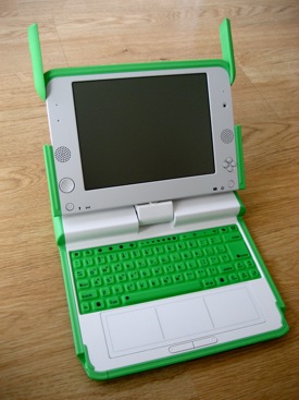
Scrutinizing the XO (OLPC) user experience
~ 19 February 2008 ~
So, I’ve had my XO laptop for nearly two months now. Over this period, I’ve used a few apps, browsed the web occasionally, and watched my sons (ages 2-7) use it. This article is an attempt to compile a coherent, albeit brief, report about the overall experience — form factor, interface, data input, and so forth. Let’s begin with the good.
The Good
It’s as intriguing as an iPhone. And by that I mean, whenever I pull it out, it seems to draw a crowd. Those who’ve heard of it are excited to see it. Those who haven’t assume I’m carrying a Fisher Price toy but quickly show interest once they discover I’m toting a full-featured laptop.
The camera is quality. For a $200 device, the embedded camera, which functions as photo camera and video camera, is really impressive. I haven’t exported any pictures yet, but the clarity and response time seem better than even embedded iSight cameras.
The Measure Activity app is a hit with kids. Measure Activity is an app that, among other features, provides a visual display of audio waveforms via mic input. This usually results in kids screaming as loud as they can to see as large a wave as possible. One evening I found myself teaching the boys about things such as amplitude and pitch by having them make a variety of sounds and seeing the resulting waveforms on screen.
The OLPC effort is truly laudable. I applaud Nicholas Negroponte and his vision of bringing educational tools to developing countries. Even if the XO doesn’t stick, he’s raised the bar of approaching and delivering higher learning for developing countries. As the Economist puts it,
Ultimately the OLPC initiative will be remembered less for what it produced than the products it spawned. The initiative is like running the four-minute mile: no one could do it, until someone actually did it. Then many people did.
Shifting to the less laudable, I present the not-so-good.
The Not-So-Good
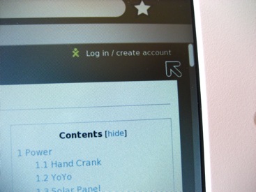
Fitts’ law is often ignored. I need not delve into a discussion about Fitts’ Law, as I assume many of you are aware of its assertions. What’s disheartening about the XO is that scrollbars, checkboxes, and a few other UI elements are terribly small and difficult to target with a trackpad mouse — small fingers or big. Consider the browser scrollbar, easily less than half the relative width of scrollbars in Windows or OS X:

The only saving grace in the example above is that the scrollbar is always pinned against the right side of the screen, effectively increasing the virtual width substantially. However, the height isn’t much larger, and it’s still a difficult target.
More input mechanisms than necessary. Three trackpads and two mouse buttons? For children who’ve never used a laptop, no less? I can’t understand this decision. The OLPC wiki describes the dual-mode potential of the trackpad, but the only part functional out of the box is the middle portion.
Further, there’s no tactile feedback around the edges of the middle trackpad, and I find myself often leaving the center area to the left or right and wondering why the mouse no longer works — until I glance down and see I’ve left the middle area. A subtle raised line on either side perceivable by touch would be enough to correct this.
As for the two mouse buttons, this is a fallacy attributable only to the experienced PC users who developed the hardware and software. Observe as my four-year-old son uses the XO for the first time and attempts first to use the trackpad as a giant button, second to click the left and right mouse buttons until discovering the correct one:
Did you catch me being thrown off by the two buttons, as well? The MacBook’s single-button trackpad would have been the obvious model to follow here.
Whose idea was “hot corners”? Seriously, this was a downright terrible decision. Hot corners, or activating UI functions when moving the mouse into one of the four corners of the screen, interrupts the current screen display and presents new options to the user. Mac users will recognize this feature if they’ve activated screen corners for Exposé.
For experienced users, hot corners can benefit workflow greatly. However, for inexperienced users, it can disrupt workflow substantially. We’ve seen this as non-Mac user candidates have come in for interviews and we’ve lent them one of our Macs for presenting work, only to watch them stumble repeatedly whenever they inadvertently hit a screen corner. (We usually have to disable Exposé because of this.)
Watch the video above again. Around 1:07, while the camera is on Isaac’s face, he activates a hot corner and the dock-like menu shows up at the bottom of the screen. He then struggles to return to the application he’s in. You’ll then see me struggle with it, as well.
Ajax chokes the browser. I can’t access Ajax / JS-heavy sites such as Netvibes on my XO, as it usually kills the browser. This isn’t a problem of the device per se, but rather of the content provider. It’s a reminder to consider the limitations of the device requesting the content when developing web experiences for non-desktop machines. (Think mobile here, too.)
Conclusion
There’s been plenty of acclaim and disdain in the press regarding the OLPC effort, and I don’t know enough yet about the device or the organization to warrant taking sides. However, I share the woes of many who’ve not received their XO, having ordered a second shortly after the first and it still hasn’t arrived. Thus, before we can overly concern ourselves with user experience, let’s hope these devices are reaching the audience for which they were intended.
6 Comments
Stock photography, type, and killer tees. Genuinely recommended by Authentic Boredom.
Thanks for sharing this, Cameron!
I’m one of those who have yet to receive theirs, but I’m not too bothered by it. I just look forward to watching my niece interact with it as your son does.
I wonder, what if you put scotch tape on the sides of the touchpad, thus giving a tactile feel for its limits. I think that the tablet mode of the touchpad will take a while to appear in future updates (it isn’t present in the release candidates for update.1), so until then, it might help (or might confuse a kid, if it one day has to be taken out to make the full resistive touchpad be usable).
As for Sugar and its UI, bear with it a bit. It’s being programmed by a small team of developers, and even though they’ve enlisted the free and open source community, it’s still in those stages where the infrastructure is being built, where outside help isn’t really very possible. That’s why you see a lot more community work going on the activities and other areas. I hope this and other future laptops targeting kids, without condecending to them, will be the norm in the future, so that our kids grow into more rational and thinking adults than us :) .
It is designed well but the drawbacks pointed in the article are significant. Small scrollbars, checkboxes etc are very important in GUI. Why they make them small? What are the purpose of three track pads?
Interesting insights. I know it’s not necessarily scientific, but I love introducing technology to kids for the reasons you’ve highlighted.
I have video of my 4 year old fully understanding how to browse the photos on my iPhone.
Crazy. My almost three year old can do exactly the same on mine already.
Authentic Boredom is the platitudinous web home of Cameron Moll, designer, author, and speaker. More…

Full-time and freelance job opportunities. Post a job...
A selection of fine reading, available for a limited time only:
- Recent job listings, testimonials, and 100th Kiva loan
- The ISO50 Field Guide to Color Management
- Upgrading the hard drive and memory in a refurbished 13" MacBook Pro
- Inspiring type: Libro di M. Giovambattista Palatino
- Randomness, vol. IX
 CSS Mastery: Advanced Web Standard Solutions A solid round-up of indispensable CSS design techniques by Andy Budd, Simon Collison, and Cameron Moll.
 Mobile Web Design A guide to publishing web content beyond the desktop. Tips, methodology, and resources. Now available.
![]() Letterpress Posters The unassuming beauty of a freshly letterpressed print.
Letterpress Posters The unassuming beauty of a freshly letterpressed print.
![]() That Wicked Worn Look. Techniques for that worn, aged, distressed look.
That Wicked Worn Look. Techniques for that worn, aged, distressed look.
![]() Mister Retro Machine Wash Filters Turn the dial to “Instaworn” with these filters.
Mister Retro Machine Wash Filters Turn the dial to “Instaworn” with these filters.
![]() Blinksale Dive in and enjoy shamelessly easy invoicing from Firewheel Design.
Blinksale Dive in and enjoy shamelessly easy invoicing from Firewheel Design.
![]() Basecamp My preferred web app for internal and client project collaboration.
Basecamp My preferred web app for internal and client project collaboration.
![]() HOW Conference Austin, June 24–27. Pentagram, Adobe, P&G, et al.
HOW Conference Austin, June 24–27. Pentagram, Adobe, P&G, et al.
![]() Web Design World Seattle, July 20–22. Practical sessions on web design.
Web Design World Seattle, July 20–22. Practical sessions on web design.
![]() Stimulate Salt Lake City, September 2009. Entrepreneurship and design conference.
Stimulate Salt Lake City, September 2009. Entrepreneurship and design conference.
Linkage:


1 Tim Van Damme ~ 19 February 2008
I downloaded the operating system and played with it for an hour or so (you can open the image with VMWare). Wasn’t exactly as simple and intuitive as I hoped. Maybe it’s because regular computer users (Mac or Windows) are “polluted” with the operating system of their choice?
Anyway, I also stand behind this initiative!