Newsvine goes mobile
~ 09 May 2007 ~

Late last week Newsvine, which bills itself as “an instant reflection of what the world is talking about”, unveiled Newsvine Mobile, neatly packaged with a .mobi domain, context-sensitive content, and a couple of handy accesskeys here and there among other things.
Admittedly, companies who mobilize their web content are becoming commonplace at an increasing rate, but this endeavor is of particular interest to me as Mike Davidson (Newsvine CEO) and I chatted a few days before the launch about life, journalism, and of course mobile device detection. Mike’s question was relatively simple:
How do I send a mobile user who has gone to www.newsvine.com over to www.newsvine.mobi or mobile.newsvine.com as effortlessly as possible?
My reply, simple on the surface yet deceptively complex in execution, was essentially that he had three options:
- “Sniff” the user agent string via device detection with the assistance of WURFL, which then automatically redirects the user to a mobile-friendly version of the content
- Implement a handheld style sheet, which doesn’t require mobilized content but rather reformats the existing content to be more suitable to mobile devices (but isn’t supported by all devices)
- Promote and encourage users to visit a second web address (newsvine.mobi or mobile.newsvine.com) for mobile-friendly content
Each of these options has its pros and cons (see “Mobile Web Design: Methods to the Madness”), to which Mike replied, “WURFL unfortunately seems pretty expensive to use, CPU-wise, on every hit and it’s not perfect, so here’s what I came up with:”
if ((self.screen.width == 800 && self.screen.height == 5000) || self.screen.width < 800) {
	top.location.href='http://www.newsvine.mobi';
} else {
	document.write('<style type="text/css">.mobile {display: none !important}</style>');
}
...
<div class="mobile"><a href="http://www.newsvine.mobi">Go to Newsvine mobile site</a></div>
A form of reverse device detection, Mike’s script does two things: 1) it sniffs out the screen width, and if it’s less than 800 px it redirects the page to newsvine.mobi, and 2) if width is less than 800 px it hides the link, “Go to Newsvine mobile site” (only mobile devices should see this link). Additionally, Opera Mini spoofs the device screen dimensions as being 800 x 5000 (!), and therefore the first bits of code are specific to Opera Mini.
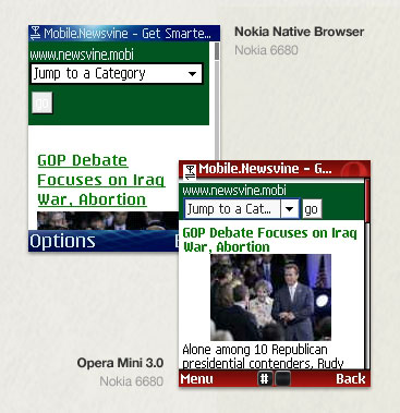
The big drawback? The script doesn’t execute the redirect immediately on some devices, and may not even work at all on others. For example, on my Treo 650 using the native Blazer browser, the redirect doesn’t execute until the entire page (+300 KB) has downloaded. On my Nokia 6680, the native Series 60 browser doesn’t redirect at all. And on my Sony Ericsson K750i, the native browser chokes without even loading the page, probably due to the fat page weight. However, for at least the first two devices, the mobile link correctly displays at the top of the page, thereby making the mobile site still readily accessible.
On the other hand, Opera Mini 3.x, which I’ve installed on all three devices (all six of my devices, actually), successfully executes the redirect immediately, which isn’t surprising given the Opera-targeted detection in Mike’s script.
To be frank, I’m not a huge fan of device detection — it isn’t 100% reliable (though in many cases it may be good enough), and any resource files such as WURFL must be maintained as each new device and/or user agent enters the market. Further, and more importantly, you’re choosing on the user’s behalf what s/he can/not see. What if the user’s device is capable of rendering the complete markup and content, and yet you’ve selectively hidden portions of it?
Anyhow, the important point here is that reputable sites both small and large, such as Newsvine, are considering the mobile user with greater frequency and thereby making earnest attempts to provide mobile-friendly content. That’s a win in my book, no matter how complex the options may initially seem for content providers.
Minutia
- Opera Mini rocks. Period. You’re missing out on an enjoyable mobile browsing experience if you haven’t popped it onto your phone.
- Consider delving into “Introduction to WURFL” by WURFL co-founder Andrea Trasatti.
- Yes, I’m still authoring The Book, contrary to critics who purport I won’t finish it before the decade’s up. No specific release date yet, but I can report that progress is being made.
18 Comments
 Veer: Visual Elements for Creatives.
Stock photography, type, and killer tees. Genuinely recommended by Authentic Boredom.
Cameron, you mentioned you had a Treo 650, have you had any luck on finding out how to get WiFi with it? I found an Wifi adapter, however they say the Treo comes with a lack of Wifi driver support…any luck?
Yep, as Cameron mentions, no system of mobilizing is perfect, and this is part of the reason why the mobile web has always frustrated me, not really as a concept but as a medium that seems to never have any agreement/cooperation from anyone. In my research for dealing with Opera Mini, I even read a passage from one of the Opera creators that said something to the effect of “You’re damn right we’re hiding our user agent string” as if they were so proud of getting their browser to make non-mobile content look good that they didn’t want to “waste” the experience on actual content made for mobile devices.
As Cameron has said many times before, providing content to mobile devices in most cases is *not* just a question of content. It’s a question of context. Stripping styles isn’t enough. Especially for a complicated site with 20 different features you’d never ever want to use on a mobile device, serving entirely different content is clearly the wise thing to do. While our quick little solution (yes, I’ll even call it a hack) above isn’t perfect and never will be, it’s good enough to take the field for us as we learn how mobile users use our site.
Incidentally, with regard to WURFL, as many bad things as I’ve heard about it, I’m still up for using it once we can make a few tweaks. We’re thinking of basically doing a first-pass check to see if you’re using one of the 10 or so most common browsers and then if you don’t pass that test, you get the full mobile device check. That way, load is minimized for the 99% of our hits that come from IE, Firefox, Safari, et al.
The reason NewsVine doesn’t redirect on the 6680 and K750i is because the redirection code is JavaScript. Relatively few mobile browsers support JS. Browser detection really needs to be in server-side code. It doesn’t have to be as heavy as WURFL. Checking the User Agent for things like ‘Nokia’, ‘MOT-‘, ‘MIDP’, etc. works pretty well
I think that we will see wurfl play a much bigger role these days as far as redirection goes, especially towards mobile sites.
I like the site and it is pretty cool. It’s easy to read newsvine
To Mike D.: I wonder what more you’d expect to get from WURFL.
You get 5000+ user-agents, 1000+ real devices recognized, lots of device data, screen sizes, markup, etc.
Oh, did I mention it’s all free and you can add your tweaks at will?
Maybe you should read again your post from 2005 and see if this works better (or maybe not): http://www.mikeindustries.com/blog/archive/2005/07/make-your-site-mobile-friendly
A bit of a rant, but hey, in Italy we say that “you don’t spit in the dish you’re eating in”.
Cameron, you mentioned you had a Treo 650, have you had any luck on finding out how to get WiFi with it?
No, haven’t tried. But I’ve heard rumors of others doing so.
Andrea, thanks for chiming in. I can’t speak for Mike, but I don’t think he’s against WURFL per se, and suggesting such a stance certainly wasn’t my intent in posting his comments. Rather, I was hoping to expose discussion regarding an alternate solution, which has pros and cons as does WURFL or just about any other solution.
Andrea: As I said, I’d like to eventually move to something like WURFL. Nobody’s spitting in anything. Not sure what the post from 2005 has to do with anything.
Why not repurpose existing content by applying the default stylesheet if the screen width is over 320px and applying a stylesheet for mobile devices if the width is under 320px?
You could leave the mobile stylesheet blank and then the content would appear styled only by the browser. I took a similar approach to NN4 by using @import to ensure that browser received no styles.
If the user resizes their screen they may find it useful to have styles removed (e.g. no horizontal scrolling required).
Steven, if you repurposed the content by serving a different stylesheet then the non mobile features would still arise. Simply using display: none; to hide these feature would still be a problem because you would still need to download these features.
Also, as Cameron has mentioned in his post, Opera Mini spoofs the device screen dimensions as being 800x5000, so the 320px width wouldn’t work.
Correct. Using Mike’s script to serve a diff style sheet rather than redirecting would be the same as using a handheld style sheet, and then you run into the same issues with poor handheld style sheet support on some devices. Modifying the actual markup, not just the styles, is often the only way to go.
using display:none; shouldn’t be a problem, at least for Opera, as I believe we don’t load content that has been set as display:none. Your mileage will vary on other browsers though.
Media queries are also another option, but again there is the issue of spotty browser support. Opera MMobile supports them and Safari on iPhone should as WebKit nightlies support them. Nokia S60 is based off WebKit, so it should support them in a future version if it doesn’t already.
Mike: Do you offer a link back to the full version on the mobile site, for users to be able to have the full experience on browsers such as Opera Mobile, that can support the full page?
David — display:none, when it works at all, may keep certain images specified in the stylesheet from loading, but it doesn’t keep inline images, extra code, and everything else from loading. Having a completely separate document to serve up is the only thing that really eliminates the unnecessary elements consistently and completely. See the link Andrea provided above to an article I wrote in 2005 for an example of the difference in end result. As for offering the ability to view the full site from .mobi, nope, we don’t do that yet. We probably should and I’ll look into it. That said though, I really *don’t* like the idea of Opera Mini trying to pretend it’s a full sized web browser. It’s a disservice to the end user, in my opinion… but hey, that’s just me.
Mike, you might consider a “view full site” link somewhere towards the bottom of each page, ala http://popurls.mobi/
Mike: I’ll have to look exactly into what Opera Mobile and mini do and don’t load when setting display:none. I had the feeling it didn’t load the code that was hidden, but I could be wrong.
We have more than just Opera Mini. Opera Mobile runs on hi-end phones, and supports Ajax and the same engine as the desktop browser, so it is a full size browser in all but the screen size (which Handheld stylesheets would be perfect for if other browsers would follow the standards and support them). I think it often on a case by case basis whether using the same page as the desktop works best (generally for blogs and such this is fine) or if a cut down mobile version is better (often for advanced web apps).
Our main policy is to give the user the choice. Which is why we like mobile versions to allow the user to go back to the full version, incase there is something there they’d like to access that isn’t on the mobile version.
I think there’s a good point that an automatic redirection may be sending the user somewhere that they didn’t want to go, even if they are on a mobile device. I know that I’ve used my mobile device to view the “full” version of a site because I wanted something that wasn’t available on the mobile site.
So I like the idea of offering the user a link to the mobile site. But I don’t see how using WURFL has to be such a big performance hit for each request— can’t it just be run once at the beginning of each session, then the results stored in session scope thereafter?
Mike D.: I already wrote my rant, so I’ll go with the positive and proactive side of me. If WURFL is not perfect and you know how it could be better, you can just contribute as it’s totally open-source. If you think it’s the best thing you can get for free, then go out and tell the owners and the contributors (the one who make the difference providing time, resources and information) that WURFL is great. If you can make better, then you could create an alternative project, or, even better, still go back to the WURFL-community and make your suggestions and step up for a leading role.
Cameron: I was actually very interested by your post and I’m always on the look for mobile sites and trying to understand if they use or don’t use WURFL. In either case, it’s good to know.
I think that we will see wurfl play a much bigger role these days as far as redirection goes, especially towards mobile sites.
Thanks.
Authentic Boredom is the platitudinous web home of Cameron Moll, designer, author, and speaker. More…

Full-time and freelance job opportunities. Post a job...
A selection of fine reading, available for a limited time only:
- Recent job listings, testimonials, and 100th Kiva loan
- The ISO50 Field Guide to Color Management
- Upgrading the hard drive and memory in a refurbished 13" MacBook Pro
- Inspiring type: Libro di M. Giovambattista Palatino
- Randomness, vol. IX
 CSS Mastery: Advanced Web Standard Solutions A solid round-up of indispensable CSS design techniques by Andy Budd, Simon Collison, and Cameron Moll.
 Mobile Web Design A guide to publishing web content beyond the desktop. Tips, methodology, and resources. Now available.
 Letterpress Posters The unassuming beauty of a freshly letterpressed print.
 That Wicked Worn Look. Techniques for that worn, aged, distressed look.
 Mister Retro Machine Wash Filters Turn the dial to “Instaworn” with these filters.
 Blinksale Dive in and enjoy shamelessly easy invoicing from Firewheel Design.
 Basecamp My preferred web app for internal and client project collaboration.
 HOW Conference Austin, June 24–27. Pentagram, Adobe, P&G, et al.
 Web Design World Seattle, July 20–22. Practical sessions on web design.
 Stimulate Salt Lake City, September 2009. Entrepreneurship and design conference.
Linkage:
Follow me: 
1 jdjohnson ~ 09 May 2007
I have noticed in the last few weeks an increase in the amount of time I spend surfing using my Blackjack, rather than my laptop, even when in the same room. Something about the ease of use I’m sure.
However, so many sites, as you pointed out, seem to crash when loading, even when meant for mobile use. As technology advances, I’m sure my phone will no longer be second to the computer when surfing the web.