 How-to: ‘Giving To Hiram’ masthead
~ 20 May 2005 ~
It’s been quite a while since I last authored a design how-to article. That changes starting today.
Some of you may have caught wind of the recently launched Giving To Hiram mini-site. Interested in learning the process used to create the masthead? This tutorial shows you how.
Step 1 – Select colors

Thou shalt figure this one out on thy own.
Step 2 – Shadowing

Simple stuff here. Just add a drop shadow and inner shadow to the white shape.
Drop shadow:- Blend: Multiply
- Opacity: 65%
- Angle: 90°
- Distance: 0
- Spread: 0
- Size: 6px
- Blend: Multiply
- Opacity: 22%
- Angle: 90°
- Distance: 0
- Spread: 0
- Size: 25px
Step 3 – Inner shadow stroke
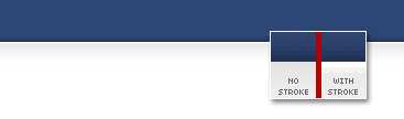
Here’s a trick I use on most of the inner shadows I apply to my artwork, including the page borders on this site: Add a simple 1px or 2px stroke to the edge of the white shape to “soften” the edge a bit. You can do this either by using the stroke layer style or by hand drawing the stroke (I prefer the second choice).
Step 4 – Add vignettes

Ah ha! Here’s where we cheat a bit. We’d like to add ornate figures (also referred to as vignettes) to this particular piece, but how to go about it? You could hand draw them, yes. Or you could cheat and use the Nat Vignette font family from Paratype. Yet again I prefer the second choice.
The vignette used in this piece is the lowercase ‘j’ from the Nat Vignette One set.
Step 5 – More ornate goodness
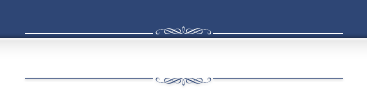
No trickery here. Just add a pair of lines and more drop shadowing to both the vignettes and lines.
Step 6 – Add some backgroundage
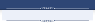
At this point, a subtle background could go a long way for enhancing this particular piece. Draw a marquee that fits the desired area, and then fill with a light shade of blue. IMPORTANT: Be sure the filled area extends beyond the edges of the lines above and below, as we’ll be erasing that area in the next step.
Step 7 – Fade the edges
To soften the edges of the background, you have a few options. But by far, I prefer to select the rectangle marquee, set the feathering to about 15px, and then draw a rather large marquee anywhere on the canvas. Then move one edge of the marquee so it overlaps the area we want to “erase.” Then hit Delete/Backspace and you’ve got yourself a faded edge.
Again, it’s important the edges of the filled area extend beyond the top/bottom lines or you may end up with a hard edge still showing after you do the fade.
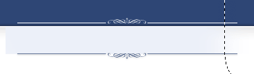
Step 8 – Final detailing

Two easy steps to polish the background: 1) Erase the corners of the light blue background layer using the eraser tool with the 65px soft round brush, and 2) set the layer to Multiply to allow the inner shadow and stroke of the white box to shine through.
Step 9 – Typography

No one was ever fired for using Trajan Pro. Can’t go wrong with such a lovely typeface.
And that’s it. Done. Easy as 1-2-3… 4-5-6-7-8-9.
![]()
42 Comments
Stock photography, type, and killer tees. Genuinely recommended by Authentic Boredom.
uhh…that’s VIGNETTES by the way! :D
Briar Press has alot of really nice ornaments for download in .eps format.
I learned a lot of cool techniques from this simple article. Thanks!
Fantastic work, as always Cam, but I do have to question… is it really a design how-to?
Adrian - Thanks. Though not sure I follow. As opposed to…? (design how-to)
Being a non-designer, I got totally lost on this seemingly simple task. My drop-shadow was all over the place (top, left and right of white box), I couldn’t get an inner shadow where your’s is and the stroke thing lost me. I tried though.
I’m willing to bet that 99% of this is due to the types of shapes I initially started with…two rectangles of the same width, one on top of the other.
as opposed to a photoshop technique how-to I think…
There is no how-to about the steps that went into the design of the header, just the construction process.
Man, commenters get picky don’t they? ;>
Cam -
Why do you prefer to hand-draw the stroke - isn’t it just the same (although non-destructive) to apply a stroke style? Just curious.
The site is lovely, by the way.
Kent: exactly. And yes, I’m the pickiest commenter ever! I think passionate debate is better than apathy.
Cameron, one of the things that’s been getting to me more and more lately, and making “design blogs” less and less appealing to many web professionals is the lack of theoretical discussion going on. Much of our discussion has been reduced to debating the merits of css techniques or interesting uses for photoshop brushes.
Not that I don’t appreciate that, but I think it’s our time now to start educating the masses about the importance of typography, color theory, proportion, balance - design.
Less of the how to do something and more of the why we should do something.
Cool. Another tutorial by Cameron. Pretty simple stuff, but it’s nice to see how others put things together. I would have done some steps differently, so it’s refreshing to see things done differently. I know I’ve changed my own techniques on occasion because of simple tutorials like these.
Thanks, Cameron.
Wow, comments all over the place. This is rather interesting.
Justin - Keep the white shape on top of the navy one.
Adrian, Kent - Is not design just as much about the composition (construction) of elements as it is about color theory, typography, etc?
Dave - I generally prefer hand-drawn strokes for work of this nature as I have greater control. Take a close look at the page borders on this site, for example. You’ll notice the stroke is 2px wide, but of two shades of white/grey. You can’t get that kind of control with a default setting.
Adrian - For every person out there wanting more why and less how, I’m certain there’s somebody wanting more how and less why. I find it hard for one to hone his/her skills if too much time is spent preaching and not enough time spent practicing.
As for more theoretical articles, there’s plenty in the cooker once things settle down around here. The whys of redesigning (and not the hows) and the musician/designer article (finally) just to name a few.
Camron: Thanks for the tutorial… and explaining your site’s borders are done in similar fashion. You’ve helped to clear up little questions I always had about some of the stuff you’ve done.
Adrian L.: Agreed… I know I could alway benefit from those of you who have more training than I, when it comes to the how-to of design.
Just curious: How might some of you classify this — a why-to or how-to article? Non-typographer’s guide to practical typeface selection
Cameron -
Not that it makes much difference, as everyone has a different style. The beauty of Photoshop is that every task has about 900 ways of being completed. :)
I’m the kind who would duplicate the layers, set the fill to 0%, set the bottom one with a 2px #F3F3F3, and the top one with 1px #F4F4F4. My reasoning is that if, all of a sudden, I wanted to make one of them lighter, like #F7F7F7, I could just double click the stroke style and change it.
While we’re sharing Photoshop tips/tricks, can anyone tell me why the default setting for the inner/outer glows is to have that hideous yellow color? ;)
It’s an interesting hybrid, Cameron. Both theory and practice. It goes through some of the reasons to use some typefaces over others, but it also discusses the technical limitations of font selection.
In terms of why vs. how, I think it’s best to consider why design choices are made, as opposed to how those choices were implemented.
The primary difficulty with this subject is that the line between production and design has been very seriously blurred by misuse of both terms on the Internet.
I am a classically trained artist, but I have an incredibly limited “design” background. Much of my visual education applies to graphic design, but I always feel I lack some of the basics that someone with a graphic design education understand.
I think this is a new area of discussion we can all move into, as we did with standards compliance and accessibility. For the most part, we’ve got the word out about accessibility, we’ve got the css/xhtml stuff sorted out.
Now we need to start improving the Design of the internet.
Yes, many of us have great sites. Some, like me, have an awful site. Maybe by opening the floor up to discussion on design theory we can increase the signal to noice level on the topic of design, and finally seperate it from Photoshop tips.
“In terms of why vs. how, I think it’s best to consider why design choices are made, as opposed to how those choices were implemented.”
I don’t think this is a “vs” argument in first place. I see what you’re getting at, and I think the two (why and how) complement each other, not compete with each other. In my experience, he who spends all his time discussing/reading theory and little time putting that theory into practice often produces shoddy work. He’ll go on about how it conforms to a grid, how the color palette epitomizes man’s lifelong struggle with love, and so on. But in the end it looks downright horrible.
At the same time, he who can design drop shadows and gradients unrivaled, yet fails to understand the theory behind the overall approach, also fails to hit the mark in a variety of ways.
I think I’ve put plenty of hard-core theory out there before (here’s another) and therefore feel no shame for freeing myself from such from time to time…
My thoughts aren’t nearly as in-depth as Adrian’s, but I enjoyed the article on Typography for both the why and how. For one who is not classically trained, rather self-taught, it did help me to organize my own thoughts when choosing my type. The links you provided made me look at my past work and critically analyze flaws - kerning, line spacing, headers, body type, etc. I now am able to better look at others work and discern if these typography principles I’m learning are in place. Keeping in mind some rules are not necessarily “hard and fast”.
So the classification of the article became a “why keep these principles of typography in mind” for me, yet also addresses “how to look at typography with a critical eye”. I’ve usually been good about noticing what “appears” to be good and right with the type, but never took the time to educate myself until this article. It became a springboard for wanting to delve further into the topic.
Keep up the good work, Camron!
Like to read your tutorial. Very well done!
I think it’s a great article!
And yes Adrian, it’s more how than why, but it’s a bit difficult to go and write an article about why not to place the ornament off-center…(Sure, it’d make one hell of an interesting article to write, but you’d probably end up with “just don’t do it” as the finished article)
As for composition (more related to why) articles; I’ve got some lined up, just need time to get a journal up and write.
I think we need a good mix of both the why and how of good design. I know I could personally use more why, but I’m sure there are just as many out there who could use more how. In any case, nicely done, Cameron, thanks.
shut up…all of you. There is nothing worse in my book than the mindless, and might I add pointless, rantings of pseudo-intellectuals. The article is what it is. Either you enjoyed it or you didn’t. Do we really need any discussion beyond that? Maybe I’m unique in my thinking, but I’m firm in it.
Great little tutorial! Just the kind of thing someone like me (a non-professional hobbyist) needs. “How” to is also very useful; keep it up the good work.
This is very interesting. Thanks Cameron. This one is a keeper. :)
Eureka! They’re called vignettes!
I’ve spent quite a bit of time plodding the web looking for some of these hitherto-known-as whatchamacallits. As much as I dislike pointless kissyface commentary, I felt I had to fess up; Its little revelations like this one that go a long way towards stoking the ideas furnace, especially for learn it yourselfers like me.
Thanks, Mr. Moll.
I could be wrong but I believe the “vignettes” refered to here are actually called “fleurons”.
Cam-
Have been checking out your site daily for the last 8 or 9 months. Keep up the good work. Love the Tutorial you should ignore those that want more Why? instead of How? and continue to teach your design ability to the next generation. I don’t know why I am drawn to your site..like soap opera’s I am forced to check it every time I log on. Go get em Cam.
I’m kind of in the boat with Elijah. I do, however, like that we can comment about what types of articles should be written, however Cameron addressed that point already, so stop going on with it. It’s not like he’s never written an article about the why. Sometimes though, the community gets burnt out on that. Many of us are designers who are more interested in someone else’s process. In this case I learned how Cameron would do something as opposed to how I would do it (also for the record self-stroking :) could be done on a separate layer which is non-destructive and you can adjust the fill settings to fade it much easier than opening up the color palette and typing in hex codes until you find one you like). I happen to think that’s valuable. It’s also why I pick up photoshop user every issue, even though it’s expensive (though printed nicely). Sometimes other people have insights into things that you don’t, just as you have insights into things they don’t.
And I second Dave Simon’s question…wouldn’t it be nice to be able to change the default glow color at least to white? That yellow, while it may be natural for incandescent lights, just plain sucks everywhere else.
Now you have me wondering—does the page top of this very site use Nat Vignette ornaments too? ☺
heh-heh, heh-heh, Joe said SELF-STROKING! heh-heh, heh-heh.
Currently coffee is all over screen, from fit of joy.
This site has some really nice fleurons. Sadly, not downloadable.
I personally would have used Fireworks to make this. For me it was nice to see how people work in Photoshop as the future of Fireworks (my favorite tool for digital layout) is up in the air due to the Macromedia/Adobe merger.
Maybe Photoshop will absorb some of Fireworks magic. As an interface designer Fireworks wins on so many levels (I have a book, but have cracked it open about three times). Soooo friendly to use.
I have heard all kinds of arguements that real designers only use Photoshop, but if only they would give Fireworks a shot they would see the beauty. Hopefully there are enough people like me that will make some noise.
My boy Armstrong makes a good case for it:
http://www.blurbomat.com/archives/2005/04/27/dead_on#000491
Have used Fireworks and Photoshop, started out on FW then moved to PS. Wouldn’t go back to FW for anything. I find PS just so much more flexible…. a more complete application I guess?
Each to his/her own tho :)
Wonderful process article — thanks! Also, the Hiram site is lovely — simple and elegant.
Whew…lots of comments. This appears to be a free fleuron font. Cameron - thanks for spending all that time to impart your knowledge to us!
Ya’ll should check out Hink’s site (comment above). Very pretty.
Having just used PhotoShop for the first time a couple weeks ago, I’m all about the HOW. Thanks for this tutorial, Cameron.
Btw, do you have another that describes how to create the side border graphics of your blog (including html/css coding?)?
Keep up the great work!
-Mike
The fleurons on the Wax Impressions site that Peter mentioned look very familiar. I think they’re from one of many the clip art books that Dover puts out. For about $10, you can get a scannable booklet and a CD with all of the images in .tiff format.
Cheers Mark. ;)
Here’s another free fleuron ttf that I found shortly after reading this article from creamundo.com.
I am also a big fan of the sundings and cropbats fonts I grabbed from dafont.com.
Okay, really late comment, but a good article. Nice work on the Hiram site - beautifully done.
Beautifully done. Thanks for taking the time to step through this process as I’m sure many people found it useful. It’s also nice to see someone else who appreciates Trajan Pro, which is a lovely font in my opinion.
Authentic Boredom is the platitudinous web home of Cameron Moll, freelance new media designer, author, and speaker. More…

Full-time and freelance job opportunities. Post a job...
A selection of fine reading, available for a limited time only:
- Jobs home page reorg
- Coming soon: Mobile Web Design, the book
- Dyson ad: Text as more than just words
- Setting sail for Europe
- Review: Sumo Omni bean bag chair
- Dashboard widget for Authentic Jobs
- Limited-time offer: $99 listings
- Nine skills that separate good and great designers
- Fire sale
- Introducing AuthenticJobs.com
 CSS Mastery: Advanced Web Standard Solutions A solid round-up of indispensable CSS design techniques by Andy Budd, Simon Collison, and Cameron Moll.
 Mobile Web Design A guide to publishing web content beyond the desktop. Tips, methodology, and resources. Now available.
![]() Letterpress Posters The unassuming beauty of a freshly letterpressed print.
Letterpress Posters The unassuming beauty of a freshly letterpressed print.
![]() That Wicked Worn Look. Techniques for that worn, aged, distressed look.
That Wicked Worn Look. Techniques for that worn, aged, distressed look.
![]() Mister Retro Machine Wash Filters Turn the dial to “Instaworn” with these filters.
Mister Retro Machine Wash Filters Turn the dial to “Instaworn” with these filters.
![]() Blinksale Dive in and enjoy shamelessly easy invoicing from Firewheel Design.
Blinksale Dive in and enjoy shamelessly easy invoicing from Firewheel Design.
![]() Basecamp My preferred web app for internal and client project collaboration.
Basecamp My preferred web app for internal and client project collaboration.
![]() HOW Conference Austin, June 24–27. Pentagram, Adobe, P&G, et al.
HOW Conference Austin, June 24–27. Pentagram, Adobe, P&G, et al.
![]() Web Design World Seattle, July 20–22. Practical sessions on web design.
Web Design World Seattle, July 20–22. Practical sessions on web design.
![]() Stimulate Salt Lake City, September 2009. Entrepreneurship and design conference.
Stimulate Salt Lake City, September 2009. Entrepreneurship and design conference.
Linkage:
Follow me: ![]()
1 Jason G ~ 20 May 2005 at 12:03 PM
I love the vingettes! Is there a poor man’s (a.k.a. free) version of a font or a brush set that has vingettes? Anyone?