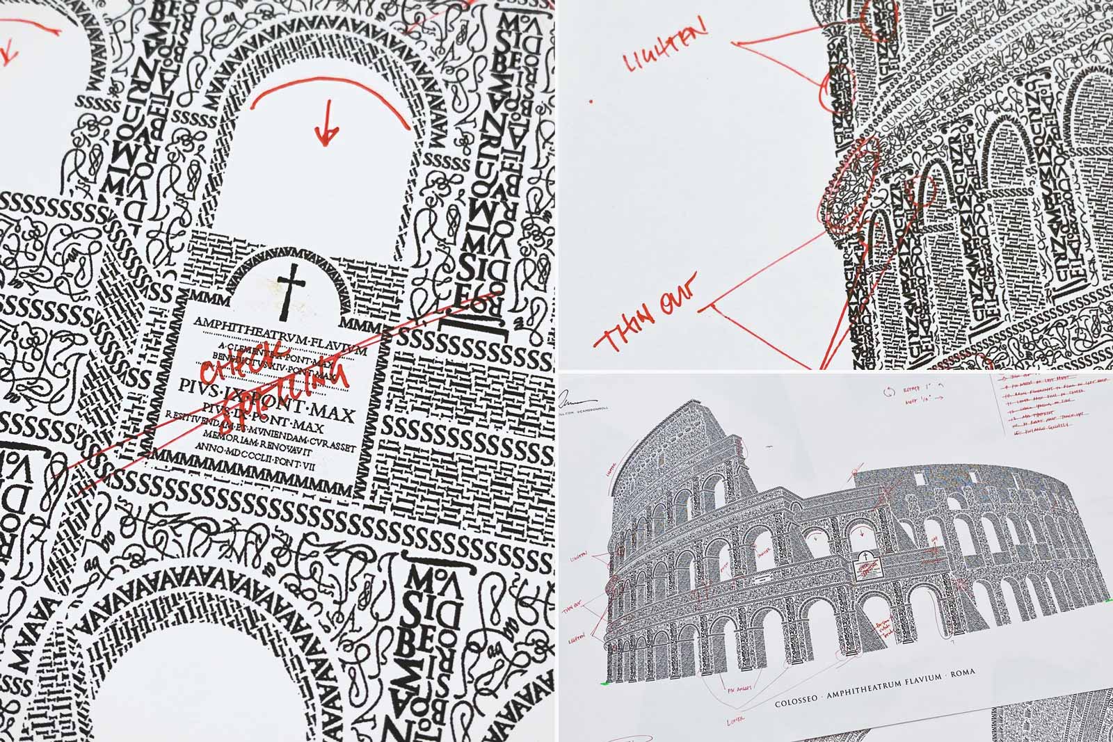
These are proofreading marks I left myself in 2010 while working on the Coliseum. I wish 2013 Me would have listened to 2010 Me: "check spelling".
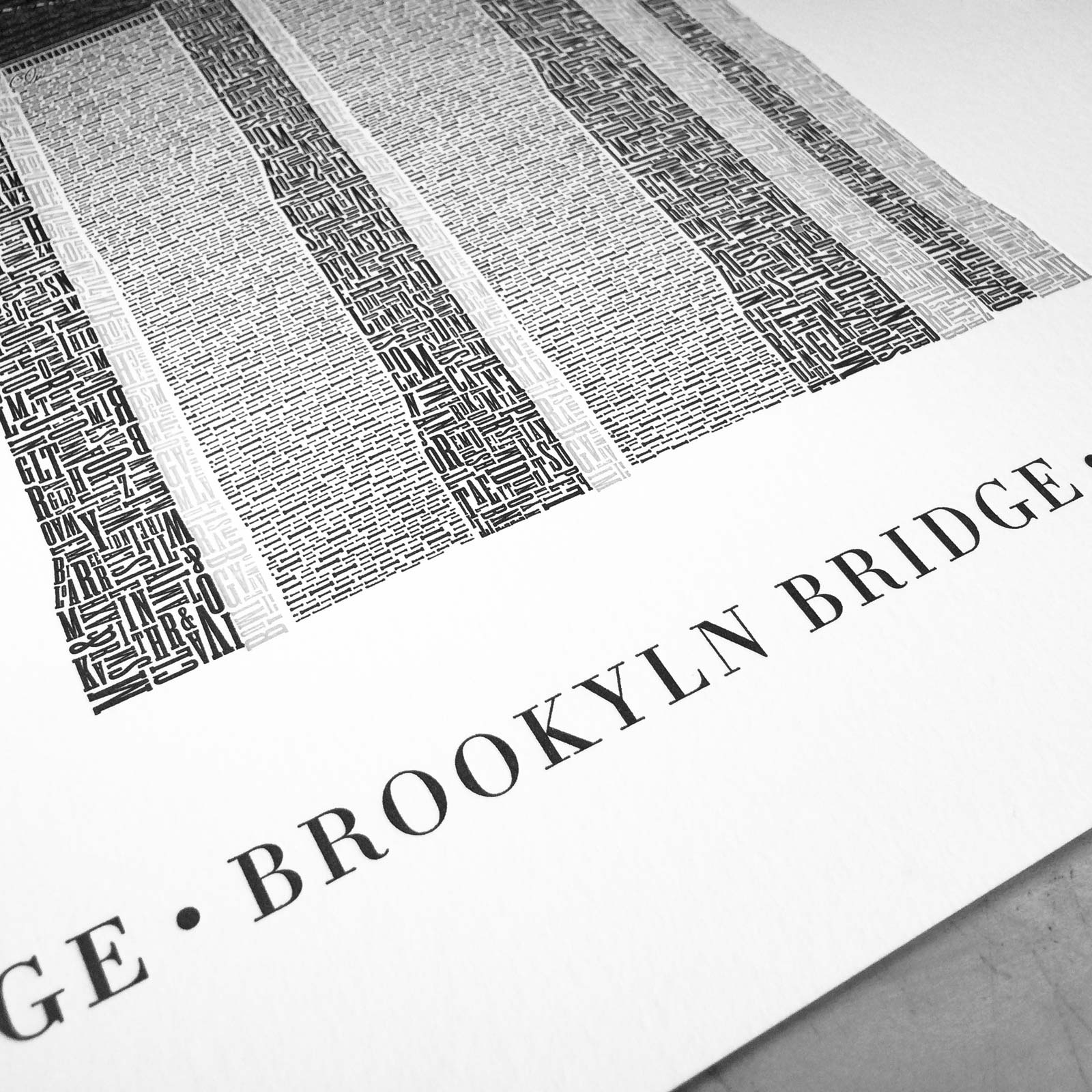
Then again I wouldn't trade anything for the now-infamous ʙʀᴏᴏᴋʏʟɴ typo in 2013.
Looking back the typo was in the artwork nearly since day one. Title is one of the first things I add when starting a new piece—it's easy to figure out and kickstarts my creativity. I even kerned the title's characters by hand on more than one occasion and didn't pick up on it.
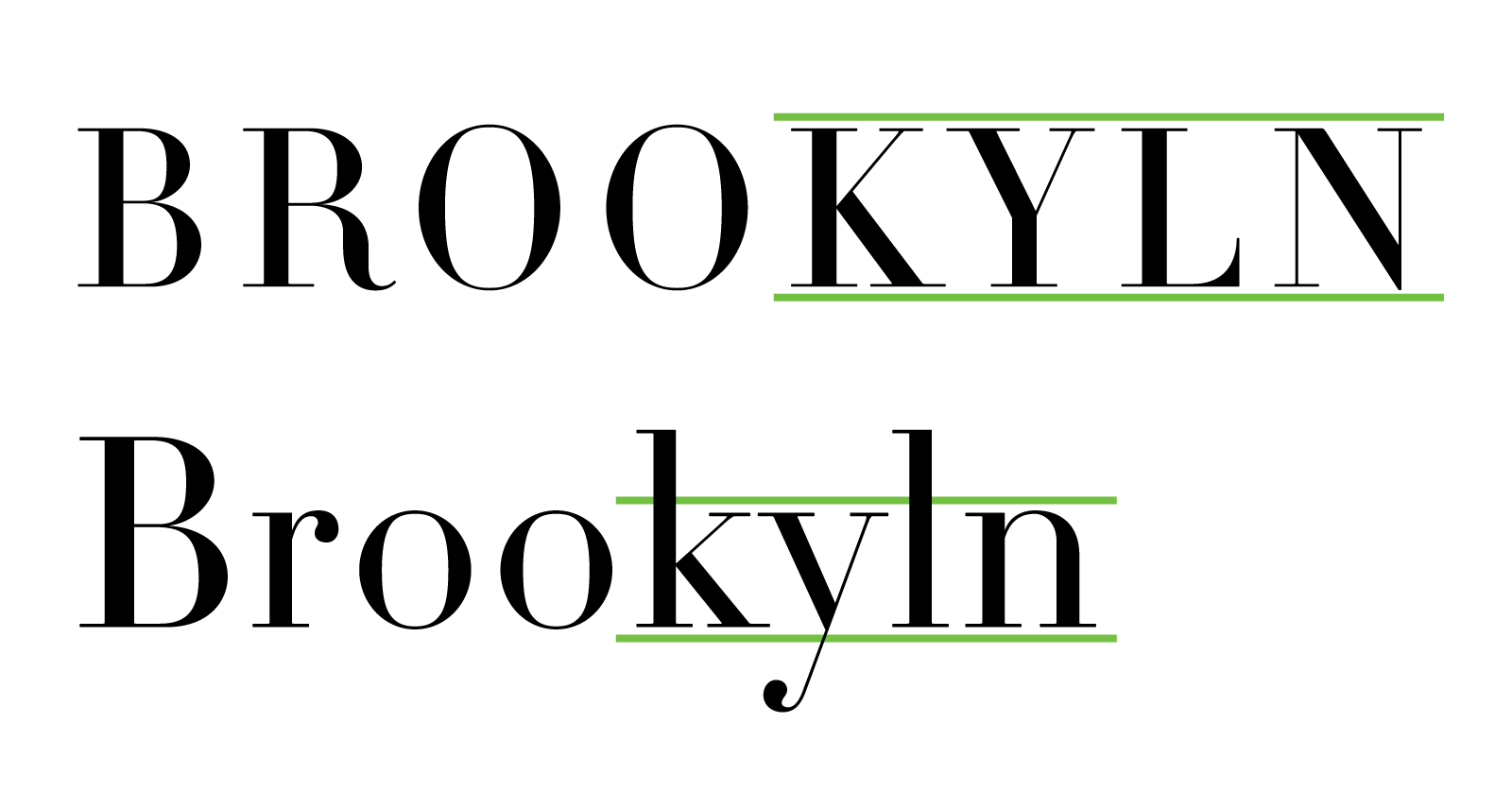
Lowercase letters in the Latin (Roman) alphabet contain ascenders and descenders. Aside from being typographically beautifully these aid in increasing legibility and scanning.
Without ascenders or descenders, scanning for typos becomes magnitudes harder WHEN EVERYTHING IS CAPS.
Here's the thing: I've had numerous people write me over the years telling the same story: They've had the Brooklyn Bridge hanging in their home or shop for years and no one has noticed the typo, even when the owner tells them to look closely.
More importantly, 13 years later typos and my personal brand have become synonymous. And I love it! Too often we think mistakes define us negatively. But when managed well mistakes refine us positively in beautiful, memorable ways.
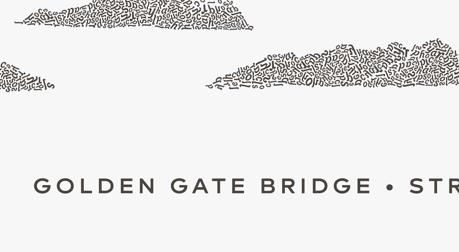
Yes, the Golden Gate is ALL CAPS. But rest assured I'm heeding 2010 Me's advice: Check spelling, Camatron.
Get your copy of the Golden Gate Bridge in type before the early bird copies are gone.