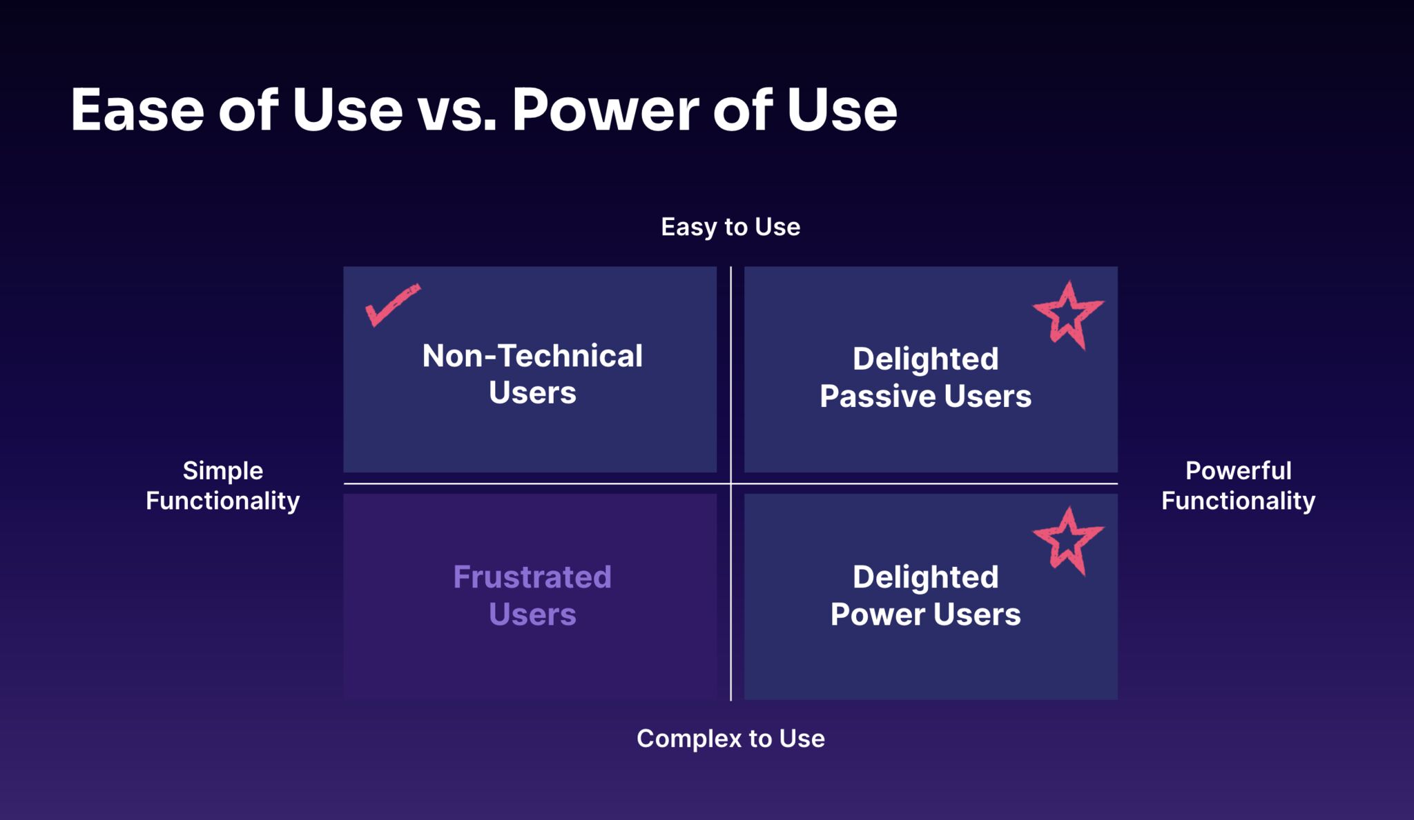
This is a diagram I've created for framing discussions at Pendo about the audience we're serving and it seems to be resonating over the past few months. It maps usage vs. functionality and demonstrates that most of the software we build serves a spectrum of users rather than one discrete audience. This spectrum only broadens as your product suite scales.
Clockwise starting at upper left:
✔️ Non-Technical Users = simple functionality + easy to use. UX table stakes. For example changing a password.
⭐️ Delighted Passive Users = powerful functionality + easy to use. Typically your less tech savvy or those limited on time. For example automated insights powered by AI.
⭐️ Delighted Power Users = powerful functionality + complex* to use. These are your power users who will want the full range of what your product can do and have time to dig deep. For example robust report creation, exporting, APIs etc.
❌ Frustrated Users = simple functionality + complex to use. UX dead zone. Imagine changing a password but it's hard to do.
Does this resonate with you and your experience building product? I may expand this into a longer article with additional context & data and welcome feedback.
—
* Complexity is relative. For example I suspect most pilots wouldn't describe the cockpit of a major airliner as "complex" but rather intuitive and usable with adequate time and training.
Special thanks to Lea Verou for the suggestion to map this as two axes.