Extensible CSS Interface II: CSS Selectors & jQuery
~ 06 March 2008 ~
This is the second article in the four-part series, “The Highly Extensible CSS Interface”. Markup and images for this article:
This second article provides an opportunity to dive deeper into markup and even a little scripting with the intent of educating the less experienced designer/coder, while furthering the knowledge of more experienced readers in the audience.
Before we begin…
Disclaimers! Of course. There are two. One, this interface is optimized for any browser that recognizes a reasonable number of the common CSS2 and CSS3 selectors supported among most browsers today. Yes, I’m speaking to you, IE6. You may kindly excuse yourself from this party. As I mentioned in a comment in Part I, I want us to explore newly supported selectors without inhibiting ourselves with IE6. All of you reading this are smart enough to make concessions on your own for IE6 as your audiences and projects demand. (For starters, consider conditional comments.)
Two, there are a few known “bugs” in the interface for which small inconsistencies will be seen from browser to browser. I’m okay with this and I hope you are, too. I’ve left these bugs in place because 1) I didn’t have sufficient time to polish the interface perfectly when this was first created (nor since), and 2) I’m hoping you’ll consider this a challenge to recommend ways to fix the bugs, thereby improving the final interface.
Moving right along, let’s begin.
Selectors
So what about these newly supported CSS2 and CSS3 selectors I keep mentioning? Well, by “newly supported” I specifically mean IE7 (and now IE8), as Firefox 2.x or newer and Safari 2.x or newer have supported them for some time. Among the most notable are probably min-width and max-width, attribute selectors, adjacent sibling selector, child selector, and alpha-transparency in PNG images.
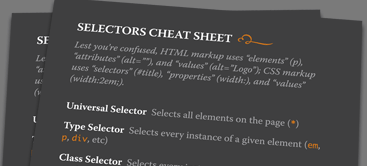
Lest you’re confused which selectors are which, download a copy of this Selectors Cheat Sheet:
If you’re at SXSW or An Event Apart New Orleans, come grab me for a finely printed copy free of charge.
I’ve made comments throughout the markup and CSS calling out selector examples in this and subsequent code downloads, but I’ll take time here to point out just one of them.
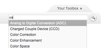
The attribute selector eliminates the need to add a class or ID to an element by referencing any attribute used in the element as a hook: type=, title=, src=, etc. This comes in handy in a variety of situations, but probably the most useful is with forms. Styling elements in the CSS with input {} leads to all elements within the form being styled, when in most cases you’re targeting text fields only, the submit button only, and so forth. You’re then relegated to adding superfluous classes and IDs to do so.
The search field and button, shown in the first image at the top of this article, serve as our attribute selector example:
<form id="search" action="">
  <input type="text" name="search" id="search-query" title="Search" />
  <input type="image" name="submit" src="img/search.png" />
</form>
Here we’d like to modify the input image (search.png) so its vertical alignment is even with the input text field. Normally this would require adding a selector hook, but notice the absence of a class or ID selector within <input type="image">. This is because we can target the image using the type attribute, and we do so like this:
input[type="image"] {
  vertical-align: middle;
  }
Any input element containing the attribute type="image" will be vertically aligned in the middle. In this case, it’s the search button. (Note: The search field requires an ID for the autocomplete plug-in. One could argue we skip the attribute selector altogether and just add the vertical alignment to the search field, as it already has an ID hook. But keep in mind I’m demonstrating possible uses for attribute selectors.)
The attribute selector is one of several CSS2 and CSS3 selectors to be explored, and the brevity of this article doesn’t provide freedom to explore them all. Consider perusing “Newly Supported CSS Selectors in IE7” by John Gallant and Holly Bergevin, as well as this selectors example and accompanying slides (included in the .zip) in which you can uncomment styles in the HTML head one at a time and view the effect they have on the content.
jQuery
Back in December 2005, I predicted the following:
I’ve been able to get by the last few years with my measly JavaScript skills, you know where you just copy and paste existing scripts? Yeah, those skills. That’ll change in 2006. The traditional role of “web designer/developer” will add JS/DOM to the existing XHTML/CSS mix. Those of us with sorry skills will expect to see a copy of Jeremy Keith’s DOM Scripting under the tree this Christmas.
I was a year or two early with my prediction, but by now it’s safe to say we’re required to know at least a minimal amount of scripting as a designer or front-end coder. For those of us reluctant to fully embrace the art of writing JavaScript, say hello to jQuery.
Karl Swedberg and Jonathan Chaffer’s very useful Learning jQuery describes jQuery as a “general-purpose abstraction layer for common web scripting.” I like to think of it as “JavaScript for scripting noobs like me.” jQuery enables you to do the following:
- Traverse the DOM
- Modify the appearance of a page
- Dynamically alter the content of a page
And it allows you to do all this without writing lines and lines of JavaScript.
Let’s pick apart a sample from the demo to understand the components of jQuery. We’ll use the “Dismiss” button in the yellow disclaimer bar at the top of our demo.
Here’s the code we add to the button’s anchor tag:
$('#alert').slideUp('slow');And here’s a description of each component:
$()- The basic jQuery construct (or function) that’s used to select parts of the document. In this example, we’re selecting an element with the ID ofalert..slideUp- A jQuery method, one of many. Methods are essentially a shortcut for lots of JavaScript. It’s pretty obvious the methodslideUpmakes the element we’re targeting (#alert) slide up.('slow')- A pre-defined string that defines how the method functions. In this case, it tells the element to slide up slowly.
This code can be added either inline or in a separate .js file (or dynamically), the latter be the more optimal method. But here’s the real kicker: I didn’t have to come up with any of the code above on my own. The construct, method, and string came pre-built with jQuery. I just had to know I wanted the element to slide up slowly, and then I looked up the appropriate references in the jQuery library that corresponded with the animation and movement I was seeking. Boom. Done.
It’s worth noting jQuery isn’t merely a cheap tactic for adding bells and whistles to an interface, though unwise use of it can thwart its intended utility much like any technology. Rather, jQuery is intended to be a really easy way to add useful interactivity to a site or app. In fact, jQuery is used throughout the interface in this and subsequent demos: jQuery autocomplete plug-in for the search field, the bio’s edit-in-place feature, and the slide up/down animation when clicking Your Toolbox. See project.js and jquery.autocomplete.js in the scripts folder included in the download. (Special thanks to Aaron Barker who wrote a lot of custom jQuery and Ajax scripting for this interface!)
Additional jQuery reading:
- Official jQuery site
- Visual jQuery (a list of jQuery methods)
- Digital Web Magazine: jQuery Crash Course
- Simon Willison: jQuery for JavaScript programmers
- Web Designer Wall: jQuery Tutorials for Designers
- Noupe: 50+ Amazing jQuery Tutorials
Extensibility
We couldn’t close this article without highlighting the series’ theme, that of adaptable interfaces. This article’s demo demonstrates the power of text extensibility throughout the interface. Try increasing the text size (Command/Ctrl + in some browsers), and give it a pass through Google Translate by translating the interface to another language such as Chinese. I plugged Dan Cederholm’s Bulletproof Web Design book in the series announcement, and I’ll plug it again here: Many of the underlying techniques for “bulletproof” text shown in this interface are covered in Dan’s book.
Pay particular attention to the Your Toolbox button. I won’t take time here to break down the markup used for the button, but you can view a button sample and accompanying slides that describe how things work. (These files are also included in the .zip.)
Also demonstrated in this article is resolution dependence, a continuation from Part I. Notice how the width of the search field changes as the browser width expands and contracts. This is done to allow additional space for all text as the width contracts, while increasing the field size for those with larger resolutions. The next article will expose several tricks for resolution dependence that dramatically alter the content and presentation. (Search field width and other resolution-dependent values are specified in /css/1024.css.)
Whew, that was more than enough to cover in one article! Suzanne and I are headed to Austin tomorrow and will hopefully meet some of you in person, and we’ll return to the series next week with Part III.
0 Comments
 Veer: Visual Elements for Creatives.
Stock photography, type, and killer tees. Genuinely recommended by Authentic Boredom.
Authentic Boredom is the platitudinous web home of Cameron Moll, designer, author, and speaker. More…

Full-time and freelance job opportunities. Post a job...
A selection of fine reading, available for a limited time only:
- Extensible CSS Interface II: CSS Selectors & jQuery
- Designer, Coder: Separate roles or one?
- Extensible CSS Interface I: The Foundation
- The Highly Extensible CSS Interface ~ The Series
- Sans iPhone: The debriefing
 CSS Mastery: Advanced Web Standard Solutions A solid round-up of indispensable CSS design techniques by Andy Budd, Simon Collison, and Cameron Moll.
 Mobile Web Design A guide to publishing web content beyond the desktop. Tips, methodology, and resources. Now available.
 Letterpress Posters The unassuming beauty of a freshly letterpressed print.
 That Wicked Worn Look. Techniques for that worn, aged, distressed look.
 Mister Retro Machine Wash Filters Turn the dial to “Instaworn” with these filters.
 Blinksale Dive in and enjoy shamelessly easy invoicing from Firewheel Design.
 Basecamp My preferred web app for internal and client project collaboration.
 HOW Conference Austin, June 24–27. Pentagram, Adobe, P&G, et al.
 Web Design World Seattle, July 20–22. Practical sessions on web design.
 Stimulate Salt Lake City, September 2009. Entrepreneurship and design conference.
Linkage:
Follow me: 
Impart your wisdom
Use the form below to add comments, suggestions, and the inevitable off-topic banter (please keep to a minimum). Feel free to use HTML code (optional), and be aware that I reserve the right to edit any raw language or banter that’s too far off topic.