 In Progress: Logo Design
~ 29 March 2006 ~
With a bit of luck and good fortune, I’ve found myself working alongside rockstar Jason Santa Maria on the revival of a newspaper more than 200 years old, the National Gazette.
First, a bit of background on the National Gazette:
The original newspaper from the 1790s was sponsored by Thomas Jefferson and ran semiweekly to fight back against the Federalist Party. The paper inadvertently helped create the modern political party by forming an infrastructure based off the paper’s circulation.
The rebirth of the National Gazette this time will be in website form and will attempt to take a more non-partisan voice to politics.
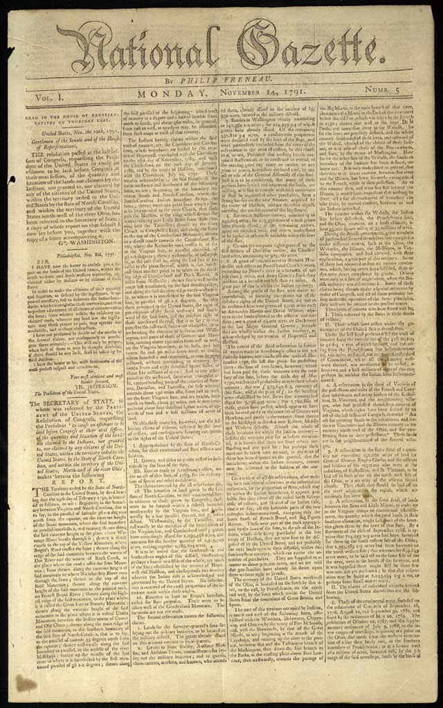
First up? The logo. Here’s a scan of the original paper:
Jason and I decided we’d each do our own take on a refreshed identity to give the team a couple of options for comparison. Of course, one approach would be to recreate the original logo with exact detail. Digitizing the original logo wouldn’t be overly challenging. But that approach presents two problems: 1) It doesn’t provide a full character set for creating sister logos down the road (which is likely), and 2) it doesn’t address the fact that the paper will be revived in a political, economic, and social climate much different than that of 200 years ago.
The most obvious choice for the initial draft was blackletter type. Now, I’ll admit I’m not a big fan of using blackletter typefaces, given most of my work is web-based. But this project undoubtedly warranted its use. After a lengthy search, I settled on Wilhelm Klingspor Gotisch as a worthy candidate. It had a refined look that could appeal to a broad spectrum of political aficionados.
The logo set in Wilhelm:

I don’t know about you, but that ‘N’ bugged me from the start. Everything else was perfect. So off I went to rework the N. The patented formula used to redraw the N went something like this:
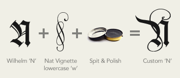
In summary,
- Use the basic shape from the original Wilhelm ‘N’
- Combine with the lowercase ‘w’ character from Nat Vignette One to recreate some of the flowing lines in the original 18th century logo
- Toss in a bit of spit & polish
- Finesse until satisficed
Insert finished custom N, add a curl to the ‘l’ reminiscent of the original logo, drop in some shadowing, and thar she blows:

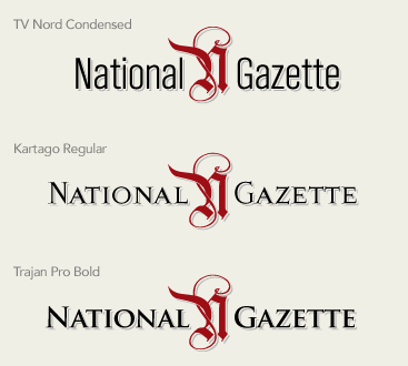
Almost done. I figured I go one step further and examine a few additional type options, given the target market of this rebirthed edition will be a younger demographic (college age or so). Worried a blackletter typeface might not appeal to all, I drafted a few versions using the custom N as a logo mark, with the text set in more contemporary typefaces: TV Nord Condensed, Kartago Regular, and Trajan Pro Bold:
Overall, I was pleased with both the blackletter and contemporary versions as being suitable updates for a logo of historical importance.
And that about sums things up. But enough about my logo. Head on over to Jason’s site to read about “Guzzy” and the exquisite work Jason did for his logo.
![]()
55 Comments
Stock photography, type, and killer tees. Genuinely recommended by Authentic Boredom.
You had me at Thomas Jefferson. With a start like this I can’t wait to see the rest of the site!
Look a little closer, Brian, at some of the fantastic ligatures Jason made from the A-L, A-Z, and T-T characters. Again, this was a collaborative effort, so we’re taking the best of both our efforts.
Kartago is a very nice font, I am going to have to add it to my collection. I like the Kartago version best but Trajan is a very nice font as well.
The Trajan looks too Italian. I would have gone with the Kartago as well.
Your custom N is beautiful!
A very interesting look at 2 separate and different approaches to tackling this issue. I think it looks great and am also interested to see where the design of their site goes. Is that something you guys are working on together as well?
While those ligatures are indeed quite nice, I have to say, I like the all-blackletter version the best. I might be biased. I think every newspaper should have a hand-drawn blackletter masthead. Just like the good old days.
Whoa! I like custom N, but the original G is simply beautiful a “NG” simbol featuring original blackletter style would have been cool too.
About the site… it’s ruby on rails?! Everything looks like is going to bee RoR now
Ooh, very nice! I’d love a more in deapth post about your process in modifying the original ‘N’ into the absolute beauty you crafted!
Beautiful work guys! The “TT” lig in the chosen comp does bug me though. In terms of the letterforms, it works well for tightening up the letterspacing, but it feels like the wrong time period. Carol Twombly modeled Trajan after letters found on Roman columns in the early first century, so using it for an American revolution-esque logo seems like the wrong context. The type treatments are gorgeous, but I do question the appropriateness of it.
I love it! Joining the new with the old was a brilliant idea. Great job preserving the history while promoting the future. I hope you guys find a way to work in JSM’s fish!
Dan: (on the topic of the TT ligature) I agree too. When I made the TT ligature (and the others) I was sort of on the fence with it for some of the same reasons. I wish I had a bit more time to tighten it up a little more. With that said, that’s just the perfectionist in me talking, and I think it’s still a solid logo.
@sosa: I expect it’ll be Rails. Rails is really the perfect solution for building custom content management systems. After all, what more is a newpaper than articles, sections, authors, comments and access rights?
Wouldn’t you rather work from Rails where you can get the feeling of everything being custom and “just so”, rather than a pre-cooked CMS which imposes all kinds of structure on you?
Very cool to read the twin posts.
It always makes me feel warm and fuzzy when basic graphic design is discussed in the tech-heavy blogosphere.
My first impression was that the Trajan option would work best. And I agree that an “NG” graphic may be very interesting.
My only critique of the “N” add-on is that it doesn’t jive with the letterform’s contrast. It seems as if the scribe wrote the letter using one pen, then created the flourish using a different one. That said, if the client likes it, job done.
I’m not a designer, but your posts (this one and Jason’s) are both fascinating. You guys do very skilled and interesting work and I am looking forward to seeing how they launch this website.
Correct me if I’m wrong, but wasn’t Washington designed to invoke the Roman Empire to impress/intimidate? The architecture is certainly heavily influenced by the Romans.
When I first saw the logo I thought this was an intentional parallel—with the typeface borrowing from the Romans as does the capital city.
However, I do think the use of ligatures does muddle the classical look.
Great point, Todd. I’ve never heard that before, but it makes sense and I’ll assume that it’s correct. Even so, if you look at typographic reference from the time period, the material doesn’t convey Roman imitation.
Transitional serifs such as Baskerville or Caslon were designed and used around the same time, so they have the appropriate feel. That’s not to say that Cameron or Jason should have used them, but they correctly reflect the typographic history.
I love the logo that is up on the site now. It perfectly reflects the combination of the paper’s origins and the modern demographic, and really suits an online newspaper. Good work.
I’m actually surprised that you didn’t start by tracing out the original typeface. Otherwise, I think it looks sharp.
Love the “N” Cameron - great work!
Todd,
Yes! We owe so much to the Romans and the Greeks, don’t we?
Washington, D.C. was planned by a Frenchman by the name of Pierre L’Enfant. He called on design patterns whose orgins lay in Baroque architecture, which, for those unfamiliar, can be seen in pretty much any plaza, town square, or beautiful open space that was designed and built in Europe in the 17th and 18th centuries. Imagine the area outside a palace.
Dan, Todd - Interesting points. Well said, well taken. The trick here was/is to revive a paper 200 years later in a period awash of typographic style. I don’t know that there’s *any* correct answer here, between Wilhelm (crafted in 1925 based on a style of writing from the middle ages), Trajan (crafted only recently based on early Roman lettering), my custom N, Jason’s fish, etc.
Instead, Jason and I were aiming more for providing options that would remain somewhat true to the original purpose of the paper while catering to a new audience in a digital society — a palette for which there’s really no right or wrong answer, in my mind.
I completely agree with using the custom ‘n’ as a logo mark as opposed to having the new logo attempt to mirror the old in respect to the type face. Using a font like Kartago give it some distinguishing features while preserving the readability for the current internet based view.
Can’t wait to see how the site turns out!
Although I understand the progression of the logotype that you outlined here, if you are just going to use the singular ornate N, why not just trace the original? Regardless, I do think the final result meets the needs to a tee.
Tony - Yes, that could also be an option. Again, there are plenty of approaches that could have been taken on this project.
The kids do enjoy the blackletter too, ya know :) I’m 22 and that one’s my favorite. Nice work.
I like the final solution best - the ligatures add a subtle but excellent addition to your original design. Personally, I’m a fan of Trajan, so that one stuck out from the start.
Nice job on this collaboration.
Fitting the demographic (I’m a 21 year old college student) I must say I love the Kartago font. I think it conveys the rich history of the newspaper to a younger audience perfectly.
fish ‘n’ chips.
rock ‘n’ roll.
fire ‘n’ brimstone.
national ‘n’ gazzette?
(see what i’m getting at?)
Look at how difficult the old newspaper stories were to read. Makes reading on a computer moniter seem ideal.
When my blog joined the 9rules Network, we launched a design with a similar old newspaper feel. I’d love to see an archive of old newspaper mastheads online. Anyone know if that exists?
dom, I think that’s a bit critical. I, and apparently everyone else reading this post, have not viewed the logo that way. Though everyone does have his or her own perception, I think your perception is one of the minority. Also, think about it in context. I don’t think viewers are going to make that mistake.
dave, a quick google search led me to this . vintage newspaper mastheads, very interesting…
Maybe to get around the fish ‘n’ chips idea you could put a “tada” behind it like you did here.
Kartago looks best.
Cameron, one day when you’re designing galaxies, they’re going to be some of the best-looking ones in the universe.
You know, the way you made that N was actually quite clever, I thought. I like that I’m not the only one who likes to mix up fonts in a logo and see what happens. The new logo I’ve created for my site redesign makes use of three different fonts, but isn’t layered like you did with that N. It’s a good idea which I’ll have to keep in mind for future experimentation. :)
Great breakdown. I love your “patented formula.” If only it could be produced into a night creme… ;-)
I liked the Kartago, too, but perhaps in a heavier weight. Trajan Pro is like old faithful to me — it’s really hard to make that type look bad in any design situation.
Hmm, every time I try to mix spit and polish with anything I wind up with a spitty black goo. Is there some special technique I’m missing?
Oh, maybe I’m leaving out the talent, experience, and, of course, The Eye. And dang it, I can’t buy that at iStockphoto.
Seriously nice work. My favorite, in case anyone is keeping a tally at home, is the TV Nord Condensed version (it’s probably just me. I still have a weakness for Helvetica, too). Mmmm, sans: tasty.
That is some excellent work. I do think Trajan is getting a bit overused (and I use it frequently myself), but it is a great font and has just the right look to project an image of power and respect. The Kartago has a more vintage feel to it, which may not quite gel with a younger audience in the way Trajan does.
The ‘N’ mark is really neat - blackletter script doesn’t have much appeal to me, but the combination of the blackletter forms with some more ornate swashes is truly inspired.
Thanks for sharing the creative process on this one…
I appreciate the thought and the finish to the custom “N” you designed, but in my opinion, the combination of Wilhelm and the Nat Vignette (lowercase “w”? It looks like an ornament) is worse than Frankenstein’s monster.
Look closely at Wilhelm. It’s a calligrapher’s font. Every stroke is modelled on what is possible with a calligraphy pen. That curlicue added to your intepretation of Wilhelm and Nat Vignette means—if you’re thinking of typefaces modelled after script—that the scribe dropped the calligraphic pen and picked up something else.
You have a good sense of design, but your “violation” (creative interpretation) of these two fonts will only produce guffaws in professional type foundries.
mistersquid - How might you apply your argument to the original logo? You make a good point, but the original logo would be a struggle to do with a calligraphy pen, too…
It’s odd that someone who would take the time to pen such a passionate comment on the proper use of calligraphic typography would have a site like his.
Well I personally love the logo, very nice work indeed, although I prefer the kartago over the trajan font.
Now all I have to do is source a download of it :)
Well, I hate to the one to say it, but…
Your “patented formula” leaves out the original logo’s N as the very basis for your “custom” one. You took a font that was close to the original in most respects to all of the logo’s characters and then modified the N to be more like the original due to Wilhelm’s N being so different. What’s hard about that?
I normally would not chime in, but your curves are simply (I hate to say)… bad. The big part of the “curvy” that looks like a horn is all off AND the loop at the bottom of the LEFT ligature of the N is where it gets seriously whack.
I realize a lot of people have stroked your ego on this and the final result is nice with the Red and the Grey drop shadow, but I feel like if you were going to base your entire logo around the N, then you would’ve take more time to perfect it.
Ultimately, I have to say that if you wanted to truly knock us on our ass, you would’ve created and entirely new CURVE STRUCTURE to your N and not based your N on the TWO letter forms already existing with the original and Wilhelm. The addition of color and shadow is nice and certainly gives a contemporary look to an older font, but ultimately the central focus of your logo (literally) is marred by what I feel is sloppy Bezier work.
Sorry, Cameron…
I realize now, that last night I was a bit harsh. I’m sorry for that. I stand by the criticism, but I wish I could’ve been a bit more constructive with it. - J
J Gowan - Whew, good thing you didn’t pull out all the stops in your critique. Oh wait…
Take a look at the final logo on NationalGazette.org. The lines were cleaned up, most notably the lower loop, after client made final selection.
lol, no worries, J. Looks like I was posting based on a cached copy of this page. Didn’t see your latest comment until after I posted.
Feedback always appreciated, whether positive or negative!
LOL! April Fools, Cameron! I loved your design from the beginning! Love your site and love your work!
I loved your designs
I am looking for beautiful designs to put in http://beautifulsites.blogspot.com
can I write about you?
OK. Truth be told, the liga on the TT could be a few points closer together. I could kick a soccer ball between those two goal posts.
As well, even if JDilla above cooled his voice down with an uneasy laugh, “LOL. April Fools, Cameron!” there are truths there in his words.
That being said, you still pulled off a good logo, a nice client and consistently intelligent design speak & work. This post, as well as your Design Eye exploits, are great for the community, a smart way to advertise and, hopefully, a good R.O.I.
Congrats, from a mildly talented “Auth.Brdm” lurker.
BTW. Nice type choices.
Usually I lurk on your site: This time I have to say:
Totally Amazing. Blew me away. Divine. Nothing anyone can say can take away the incredible work that you put into your site-designs.
The work on that ‘N’ begs the question:
What program do you use to accomplish such an ‘awesome’ feat?
Good ol’ Illustrator, much to the chagrin of others (wink, Greg).
I really enjoyed reading this. Very inspiring and I love the results :)
Totally fantastic work. Personally I prefer the old-style blackletter one to the contemporary (despite being young I still find it more appealing) but the finished product still looks great.
You make such things seem so easy!! ;)
Not only an impressive, elegant design, but I’m also pleased to see such openness. Sharing pitch designs is something which enriches us all, as well as positioning you guys even stronger as capable experts in your field. Bravo!
But speaking of not being satisficed with the N, what’s with the Trajan Pro N? Am I the only one here who has the feeling it’s been chopped off at the top left? That corner draws my eye like a red sore…
Matt - Likely just the way it resized. Check the full-size version on the NG site and see if it’s the same.
Authentic Boredom is the platitudinous web home of Cameron Moll, freelance new media designer, author, and speaker. More…

Full-time and freelance job opportunities. Post a job...
A selection of fine reading, available for a limited time only:
- Jobs home page reorg
- Coming soon: Mobile Web Design, the book
- Dyson ad: Text as more than just words
- Setting sail for Europe
- Review: Sumo Omni bean bag chair
- Dashboard widget for Authentic Jobs
- Limited-time offer: $99 listings
- Nine skills that separate good and great designers
- Fire sale
- Introducing AuthenticJobs.com
 CSS Mastery: Advanced Web Standard Solutions A solid round-up of indispensable CSS design techniques by Andy Budd, Simon Collison, and Cameron Moll.
 Mobile Web Design A guide to publishing web content beyond the desktop. Tips, methodology, and resources. Now available.
![]() Letterpress Posters The unassuming beauty of a freshly letterpressed print.
Letterpress Posters The unassuming beauty of a freshly letterpressed print.
![]() That Wicked Worn Look. Techniques for that worn, aged, distressed look.
That Wicked Worn Look. Techniques for that worn, aged, distressed look.
![]() Mister Retro Machine Wash Filters Turn the dial to “Instaworn” with these filters.
Mister Retro Machine Wash Filters Turn the dial to “Instaworn” with these filters.
![]() Blinksale Dive in and enjoy shamelessly easy invoicing from Firewheel Design.
Blinksale Dive in and enjoy shamelessly easy invoicing from Firewheel Design.
![]() Basecamp My preferred web app for internal and client project collaboration.
Basecamp My preferred web app for internal and client project collaboration.
![]() HOW Conference Austin, June 24–27. Pentagram, Adobe, P&G, et al.
HOW Conference Austin, June 24–27. Pentagram, Adobe, P&G, et al.
![]() Web Design World Seattle, July 20–22. Practical sessions on web design.
Web Design World Seattle, July 20–22. Practical sessions on web design.
![]() Stimulate Salt Lake City, September 2009. Entrepreneurship and design conference.
Stimulate Salt Lake City, September 2009. Entrepreneurship and design conference.
Linkage:
Follow me: ![]()
1 Brian Sweeting ~ 29 March 2006 at 09:17 AM
So it looks like they went with the logo set in Trajan Pro Bold. Nice work.